Building a design system that lets FedPoint ship multiple products from one shared foundation.
Design System at FedPoint · Improving Design & engineering velocity
WCAG AA
All components
tested
20+
Components shipped
50+
Design tokens
defined
3
Product themes from
one system
In this Project
Why it matters
Engineers rebuilt the same components.
Before this system, every new product at FedPoint started from scratch. Engineers rebuilt the same components. Designers re-made the same patterns. The system I built changed that one foundation, multiple products, zero duplication.
~40%
faster design on new
products no more
rebuilding components
from zero.
~30%
less engineering time
states, variants, and
specs pre-handled in
react.
1 source
of truth for all products
update the token,
everything updates
How it started
Every time a new product needed to be built, the team was starting from scratch.
FedPoint was going through a platform migration and the UX team had a real window to do something structural. We weren't just moving the UI to a new codebase, we had a chance to rethink the SDLC entirely. I jumped on it.
The problem was obvious, every time a new product needed to be built, the team was starting from scratch. Same button, redrawn. Same input, re-specced. Same pattern, re-explained to engineering. It was effort-expensive and inconsistent.
My job was to fix that process.
My job was to fix that by building a design system that could serve the entire product ecosystem from a single source, with tokens that let each product look and feel distinct without ever touching the component layer.
Andrew Zarbo (UX Lead) oversaw the initiative. I owned the architecture, the component builds,
the token structure, the documentation, and the real-time validation through a live B2B portal all running in parallel.
How I did it
Audit. Foundations. Token architecture. Components. Auto Layout rules. Documentation. Live validation.
- Audit: Catalogued every component, style, and inconsistency across the existing product UI before writing a single token.
- Foundations: Defined the grid, typography system, and color pool, the base layer everything else sits on.
- Token architecture: Built the three-tier token structure in Figma Variables i.e primitives, semantics, component-specific with multi-product theming as a first-class feature.
- Components: Built 20+ components referencing tokens throughout so any theme update propagates automatically across every component at once.
- Auto Layout rules: Defined spacing, resizing, and alignment rules so every component behaves predictably regardless of content or context.
- Documentation: Wrote usage rules, component anatomy breakdowns, and availability status for designers and engineers both.
- Live validation: Tested the system in parallel with a real B2B portal build not in isolation. Every gap I found got fixed in the system before it could become technical debt.
Audit
I’ve learnt through my mistakes.
The biggest mistake in design system work is jumping straight to components. Trust me, I’ve learnt throught my mistakes. Have built 3 Design Systems before and made sure that this time I deliver an effective one in the time frame assigned to me i.e three months.
I spent real time understanding what was already there the patterns that worked, the ones that didn't, and the systemic gaps that were quietly slowing down every sprint.
Visual styles
Full sweep of colors, type, shadows, and iconography across the product to understand the existing range and scope.
Existing components
Inspected every component for missing states, broken auto layout, and hardcoded values that
would block token adoption.
Spacing grid
Determined the baseline grid (4px vs 8px) this decision cascades into every spacing token in the system.
Behavioral inconsistencies
Mapped interaction pattern gaps the same action done differently in three places across the product.
Theme readiness
Evaluated how ready the existing system was for
multi-theme support spoiler, it wasn't, everything was hardcoded.
Layout & density
Documented layout inefficiencies across views to
establish pre-structured layout templates in the system.
Foundations
Letter kerning, in some cases.
The color pool existed already. What didn't exist was a structured type system or a consistent grid. I
went as deep as defining line heights, paragraph spacing, and also letter kerning, in some cases.
These aren't cosmetic decisions. They're the
difference between a system engineers can implement precisely and one they have to guess at.
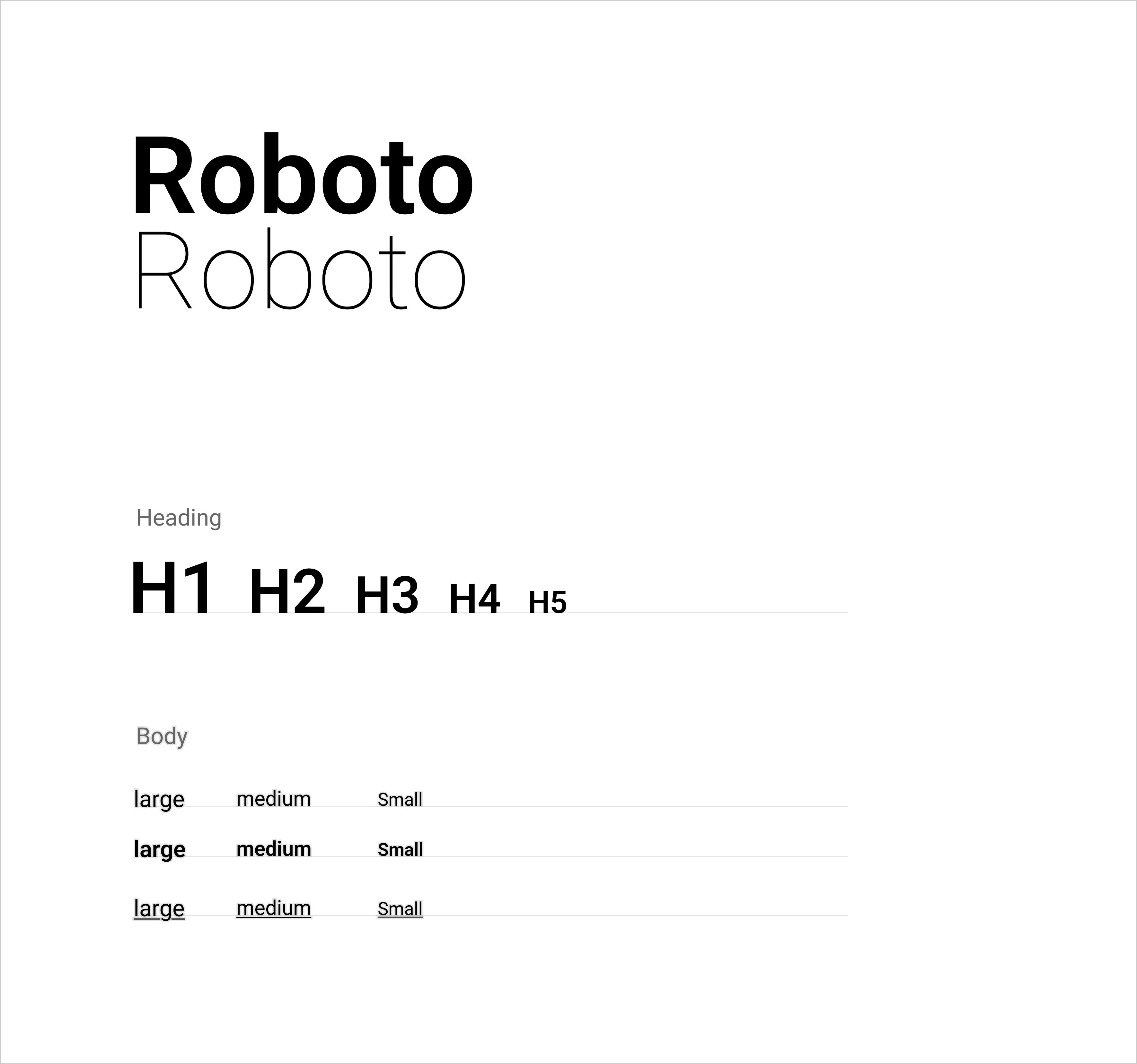
Primary Type: Roboto
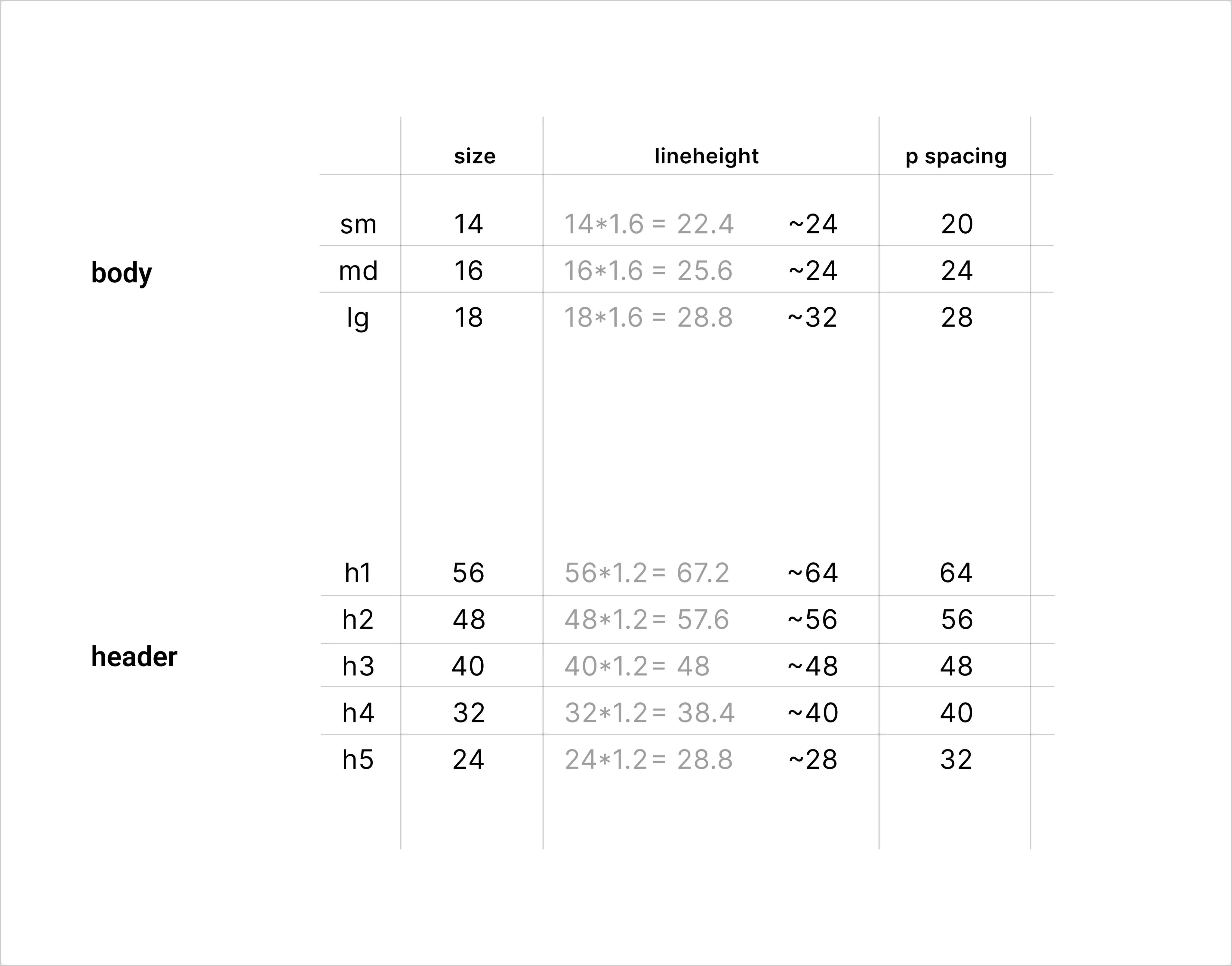
Typography scale sizes, line heights, p spacing
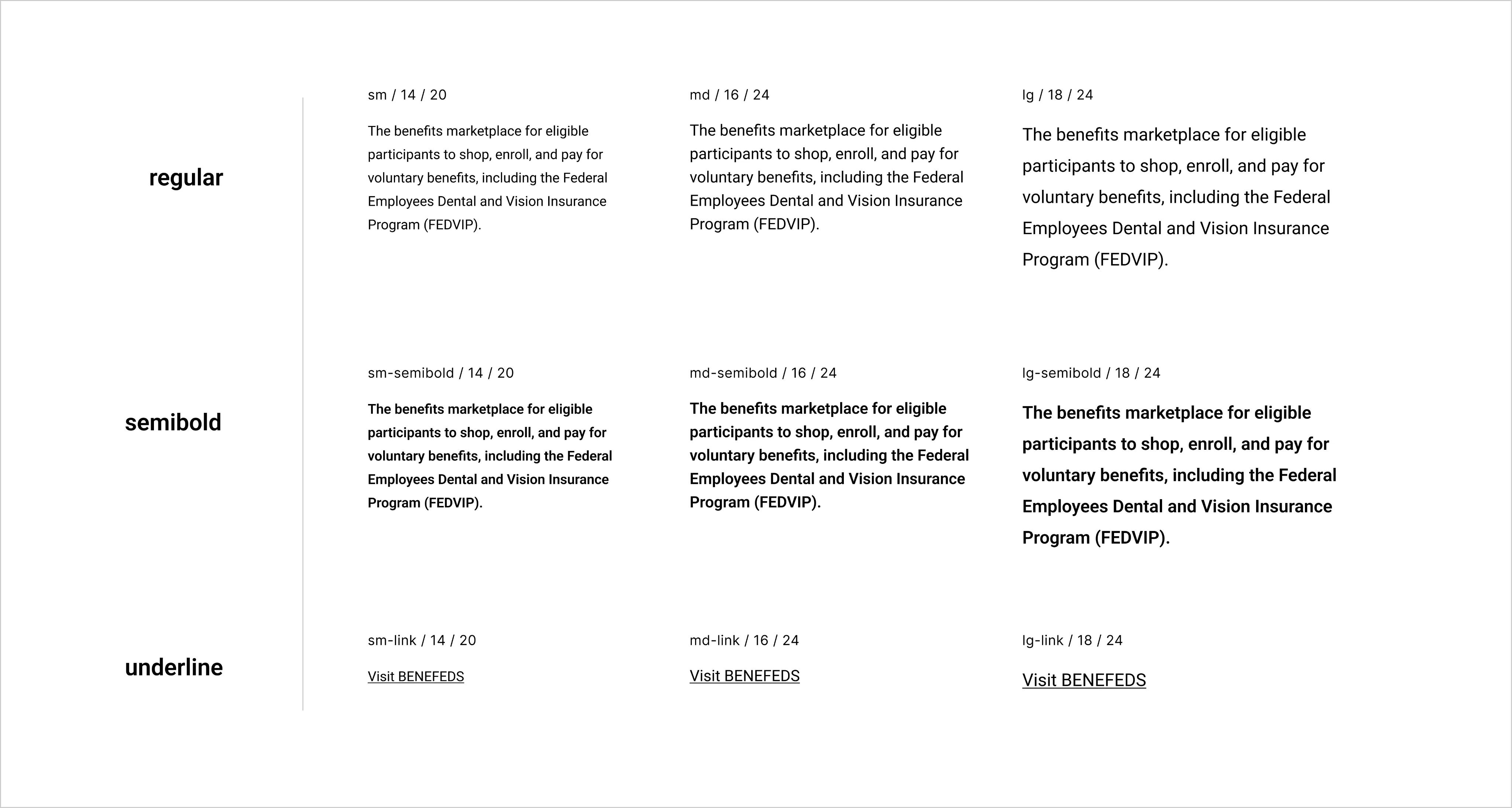
Typography scale accessibility testing
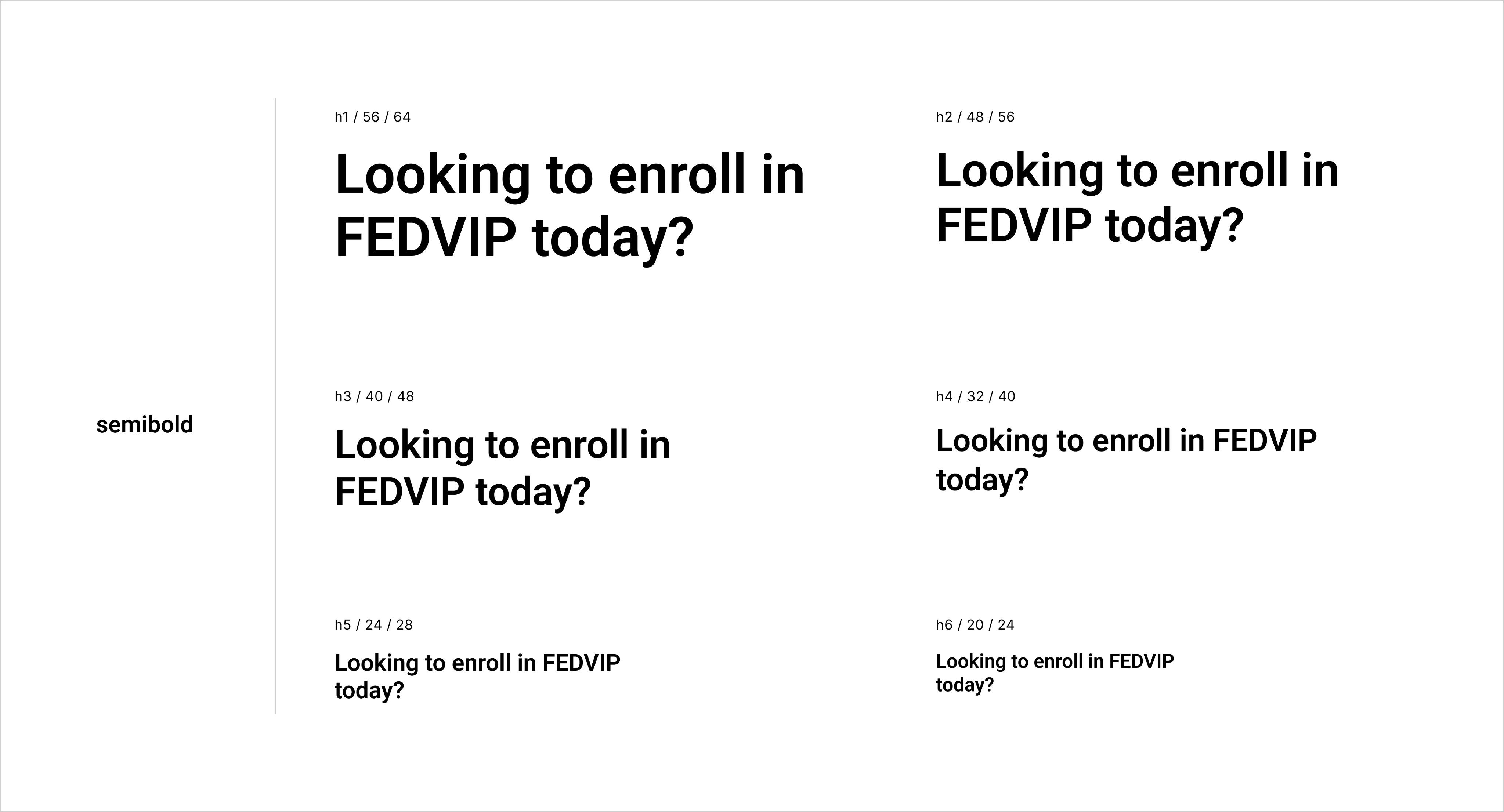
Typography scale accessibility testing
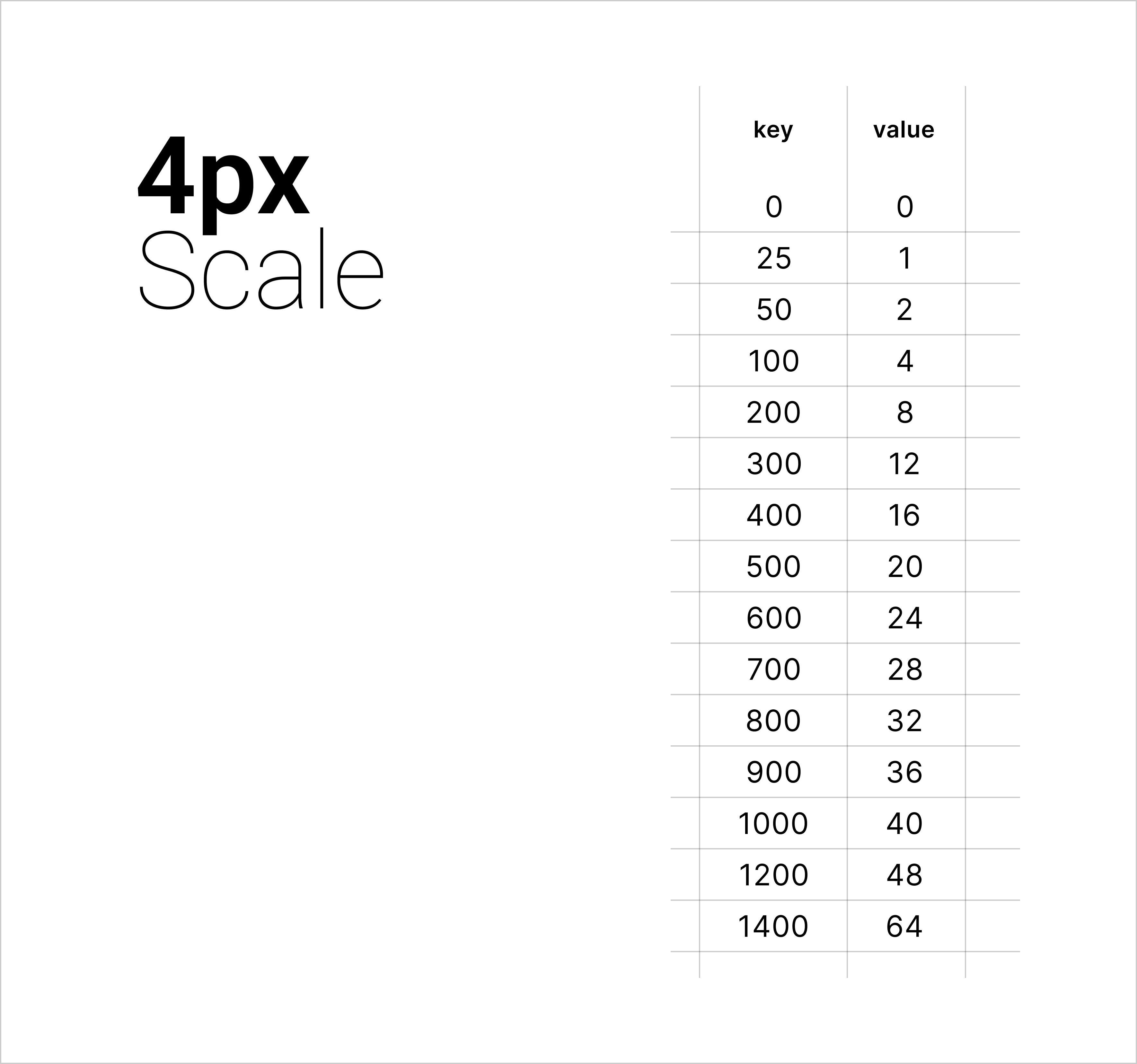
Space scale mapping
Tokens
Every value has one home. Everything else references it.
This is what makes the system actually maintainable. I defined all spacing, color, font, and shadow
values as tokens in Figma Variables structured in 4 layers so the right thing gets updated when things change, and nothing breaks when it does.
Primitive Tokens
Raw values : hex, px, ms
Semantic Tokens
Role-based : surface, text, border
Responsive Tokens
Breakpoint-aware overrides
Component Tokens
Scoped to specific components
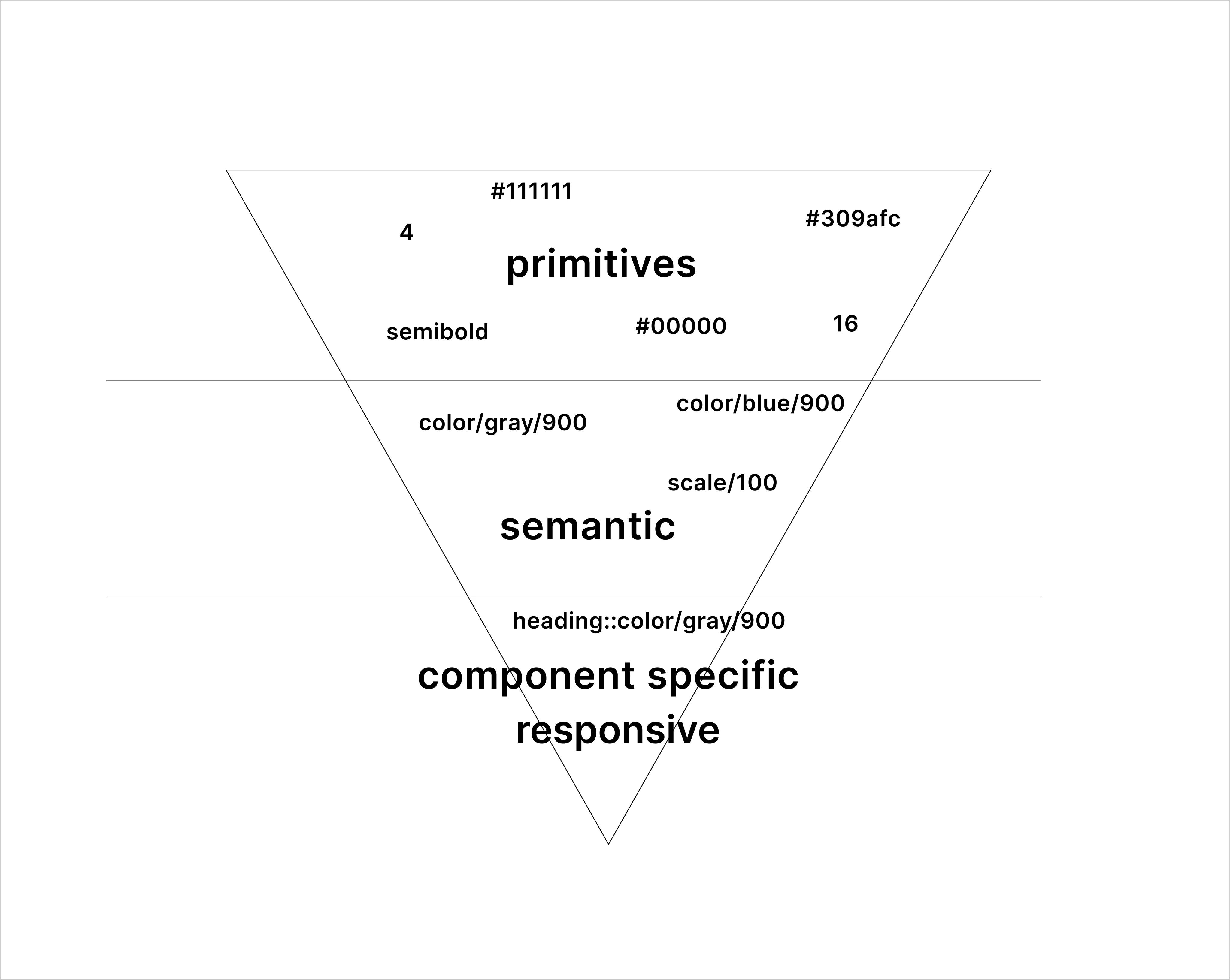
Token Map
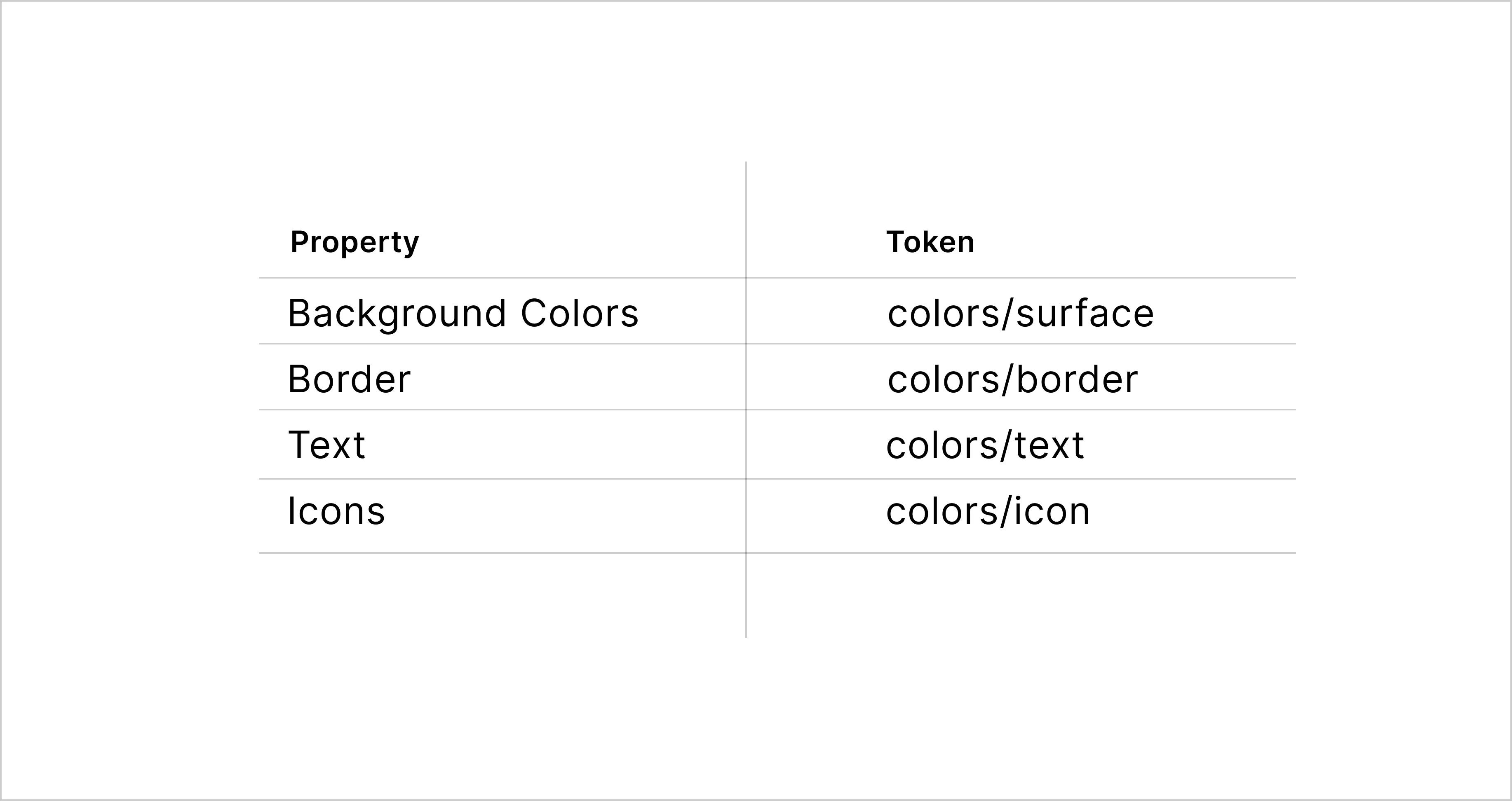
Semantic Token References
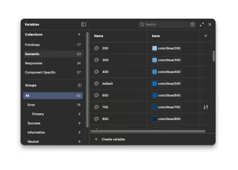
Semantic Tokens
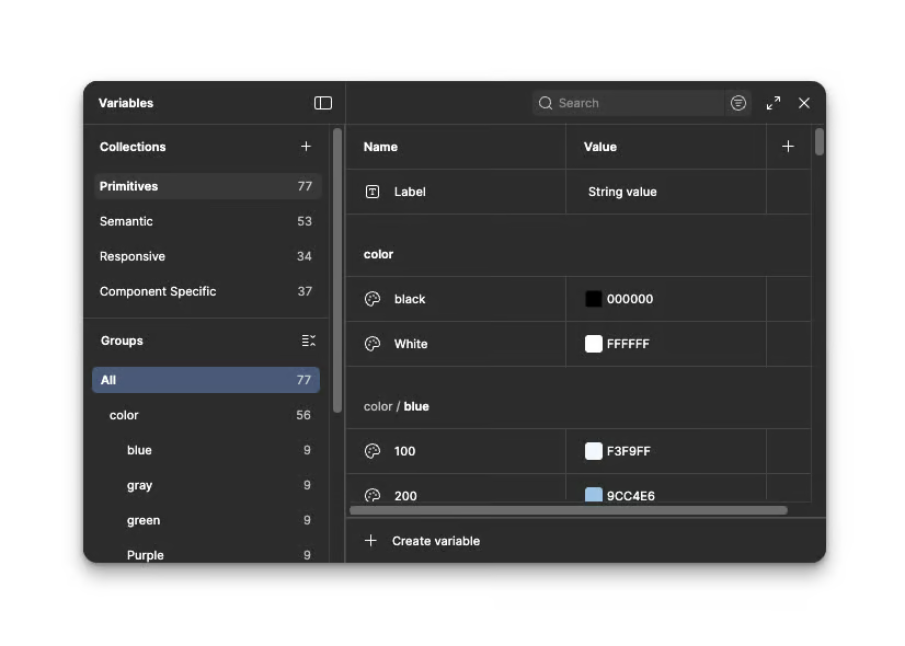
Primitive Tokens
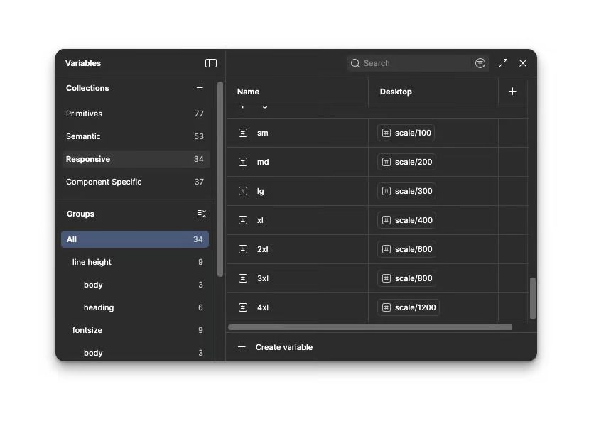
Responsive Tokens
Components
Every component built to be swapped into any product theme.
I referenced Apple HIG, Atlassian, Salesforce Lightning, Uber, and Material Design for each component not to copy, but to understand the decisions behind them.
Then I built for FedPoint's specific product surface: enterprise B2B, dense data, federal UX standards.
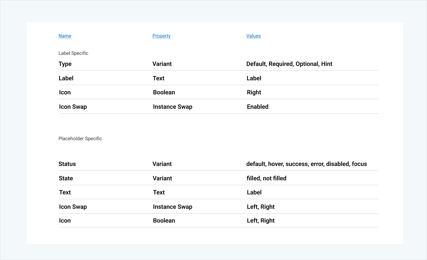
Every component has all required variants, booleans, nested instances, and focus states, built to pass WCAG AA and give engineers a complete spec they don't have to interpret or fill in themselves.
Some of the examples of components package I built:
Button
size, state, leadingIcon, trailingIcon
Default, Hover, Disabled, Focus, Active, Loading
Input
size, state, label, helpText, errorMessage
Default, Focus, Error, Disabled
Checkbox & Radio
checked, disabled, label, description, error
Default, Focus, Error, Disabled
Data Table
nested, selectable, hover, filter, sort, row actions
Default, Hover, Selected, Sorted
Navigation
items, collapsed, activeItem, header, footer
Expanded, Collapsed, Active
Tabs
orientation, variant, size, active
Active, Inactive, Hover
Modal
open, size, layout, actions
Open, Closing, Overlay
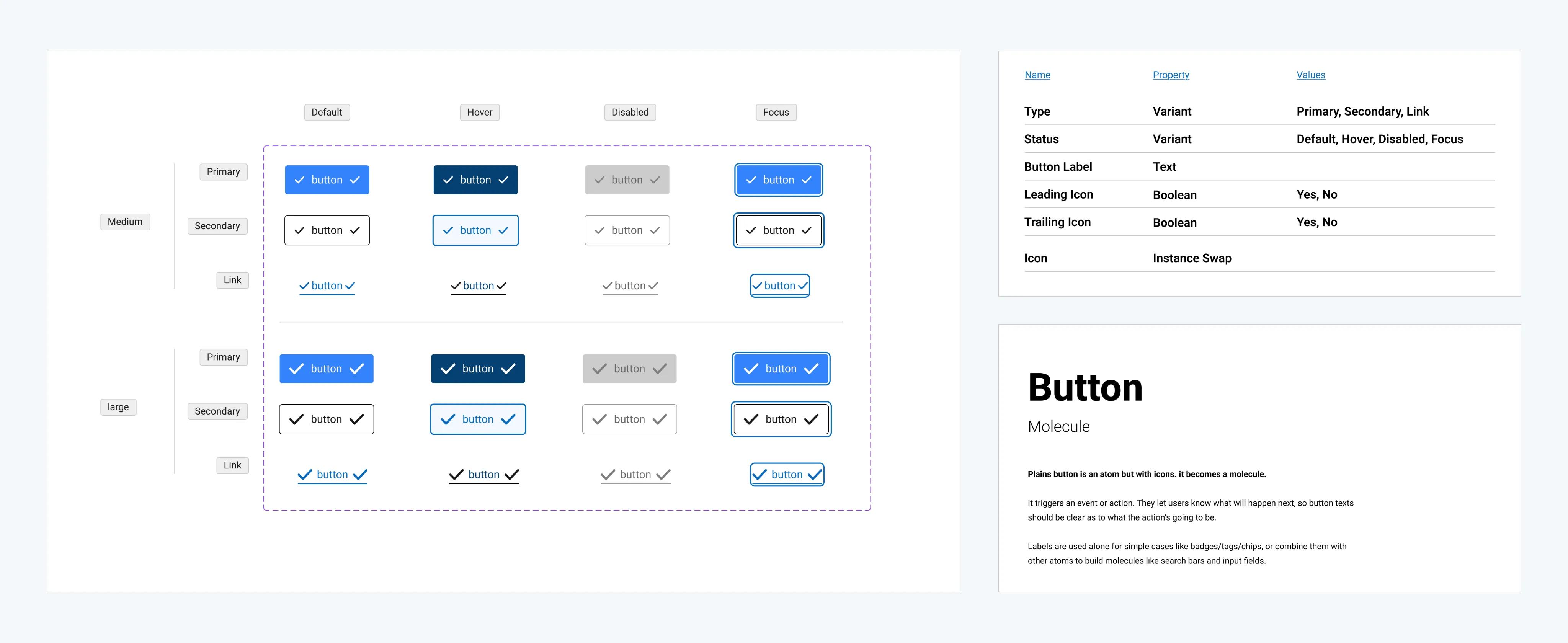
Button Component Package
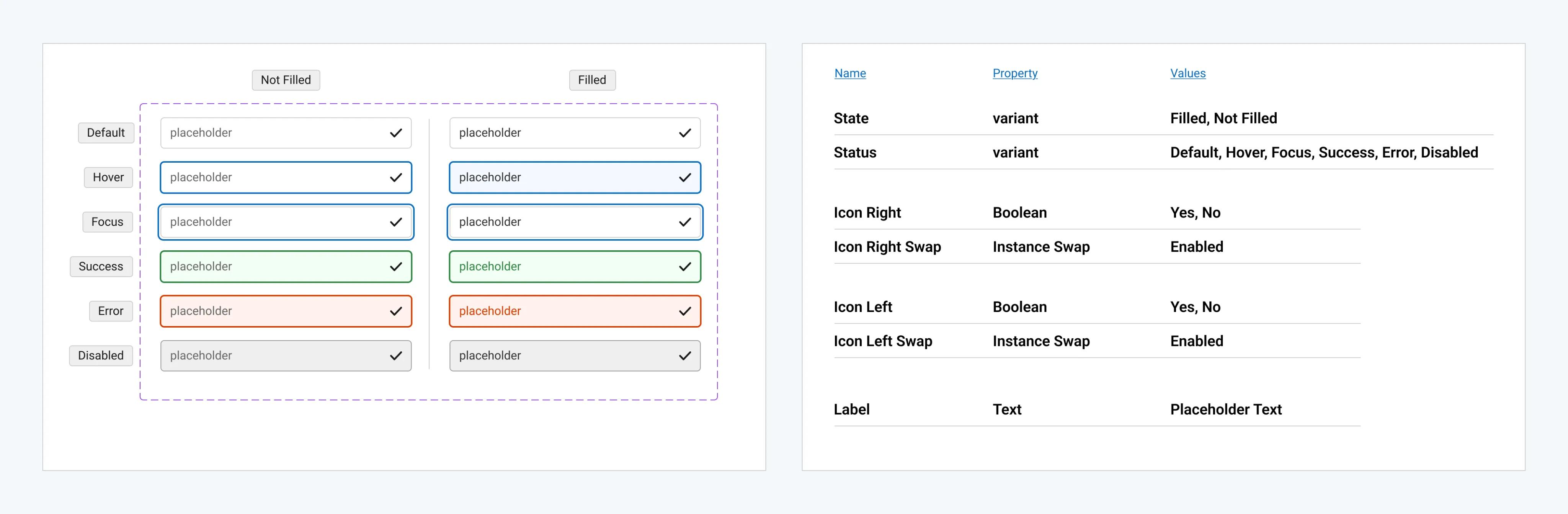
Input Component Package
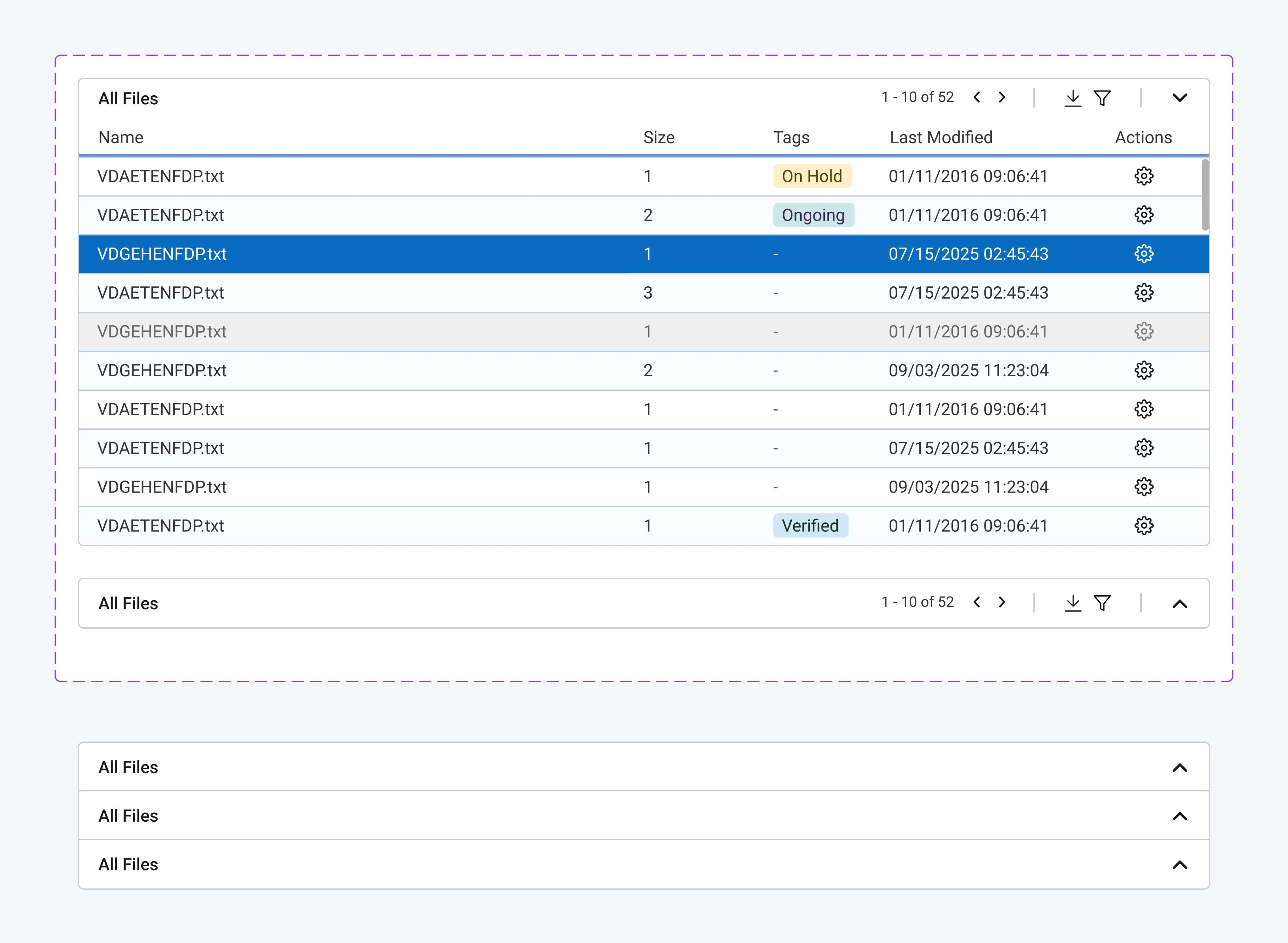
Table Component Package
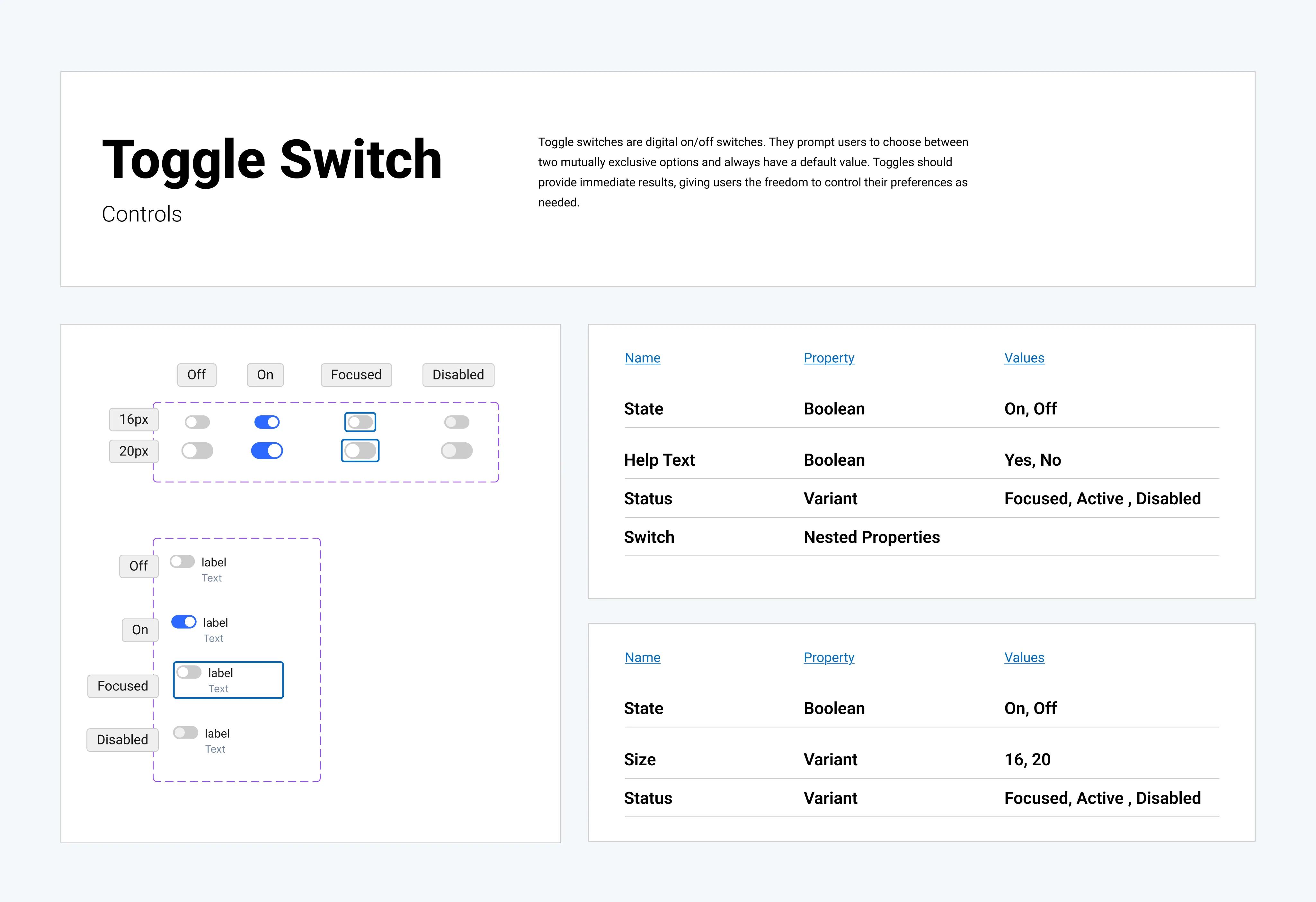
Toggle Switch Component Package
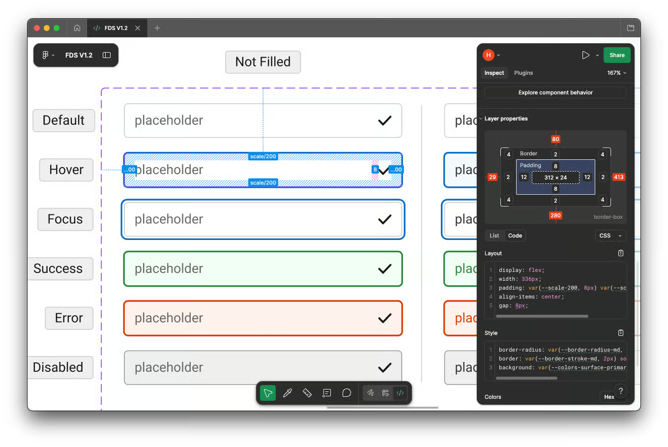
Auto Layout Rules
Spacing that scales, not spacing that breaks.
Auto layout rules aren't just a Figma nicety, they're how I made sure that when engineers implement these components, they behave exactly as designed regardless of what content goes in them. No manual overrides, no edge cases that only show up in production.
Consistent Padding
For example the button: 16px horizontal, 8px vertical on HUG automatically adjusts when label text changes, no manual resizing.
Flexible Resizing
Cards expand to fit content within defined max-width constraints adapts without breaking visual balance.
Even Distribution
Navigation items distribute evenly using fill container stays correct whether there are 3 items or 8.
Content-aware layout
Two-line field labels stay aligned with their inputs the layout system handles it, not the engineer.
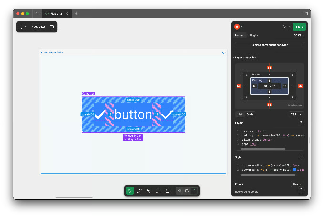
Consistent Padding
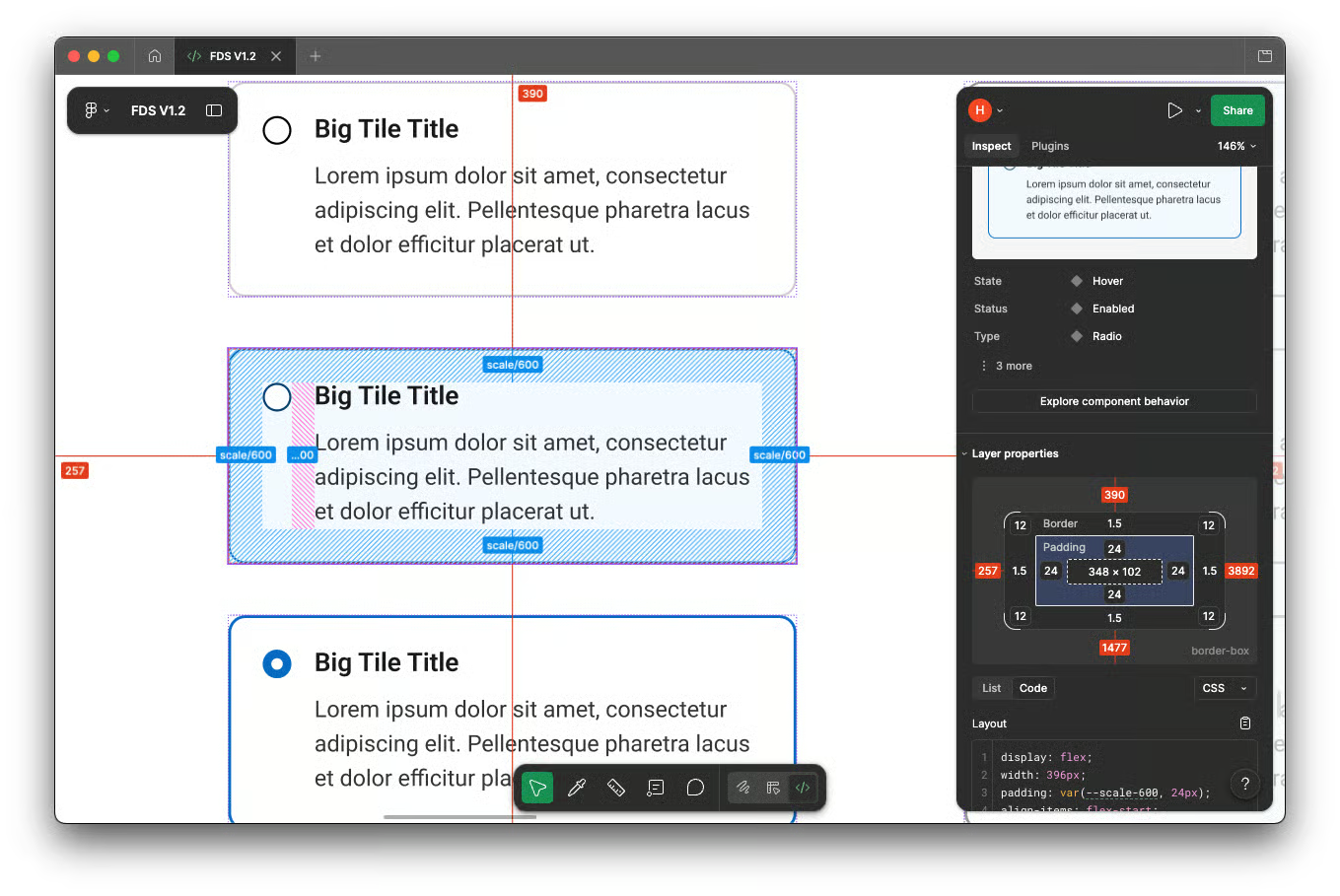
Flexible Resizing
Content-aware layout
Documentation
Wrote it for 2 audiences: Designers & Engineers
Documentation was non-negotiable. I wrote it for two audiences: designers who need to know when
and how to use each component, and engineers who need to know exactly what to build. Same
source, different lenses.
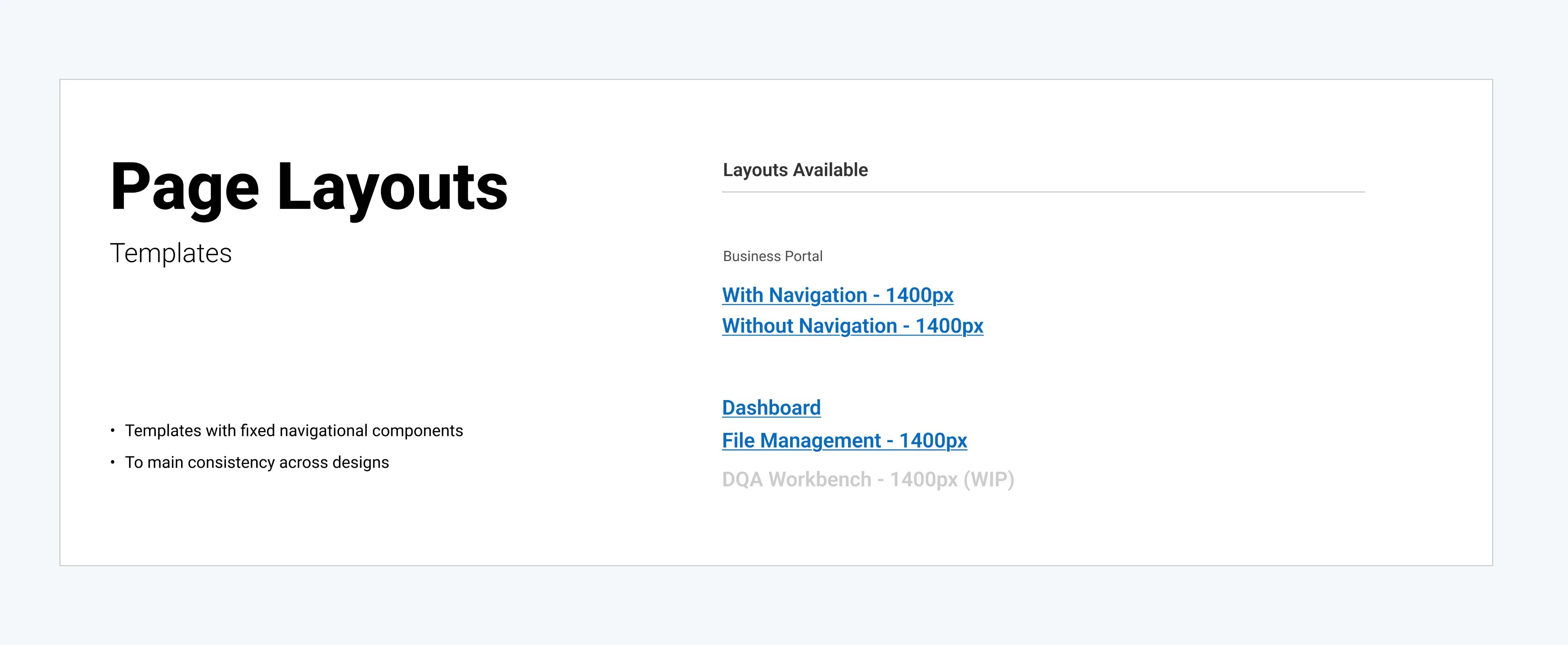
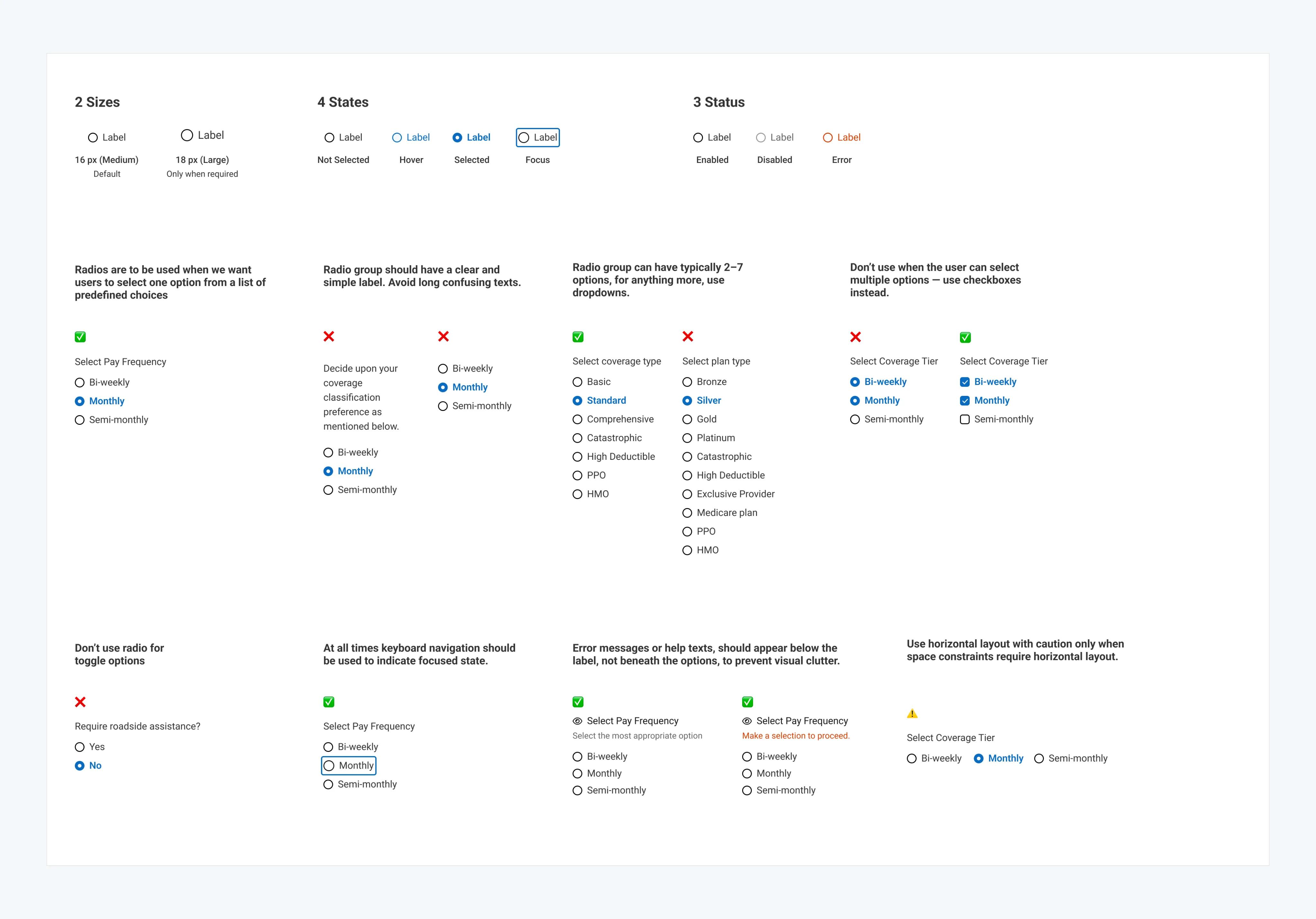
Component Briefs
Short definition for every component — what it is, when you'd reach for it, when you wouldn't.
Usage Rules
Explicit do/don't rules to prevent the exact inconsistencies the audit found in the first place.
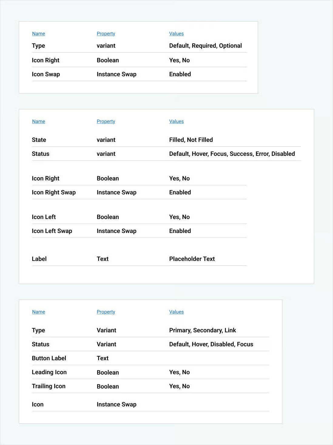
Anatomy Breakdowns
Every state, variant, and attribute documented, engineers see what they need to build, no interpretation required.
Availability Status
Live tracker so engineering always knows what's ready to build vs still in progress no blockers, no surprises.
Validation
I didn't build it in isolation. I tested it live.
The thing that made this system different from every other design system I've worked on is that I validated
it inside a real product on the same timeline. Not six months later. Not in a handoff review. As I was
building the system, I was also designing the B2B Business Portal using it.
Every gap I found in the portal became a fix in the system the same day. Every component that broke in an edge case got updated before it hit engineering. By the time the React library team started implementing, the system was already proven. Weekly stakeholder demos ran on Figma
prototypes built entirely with system components and the business team was validating the system without even knowing it.
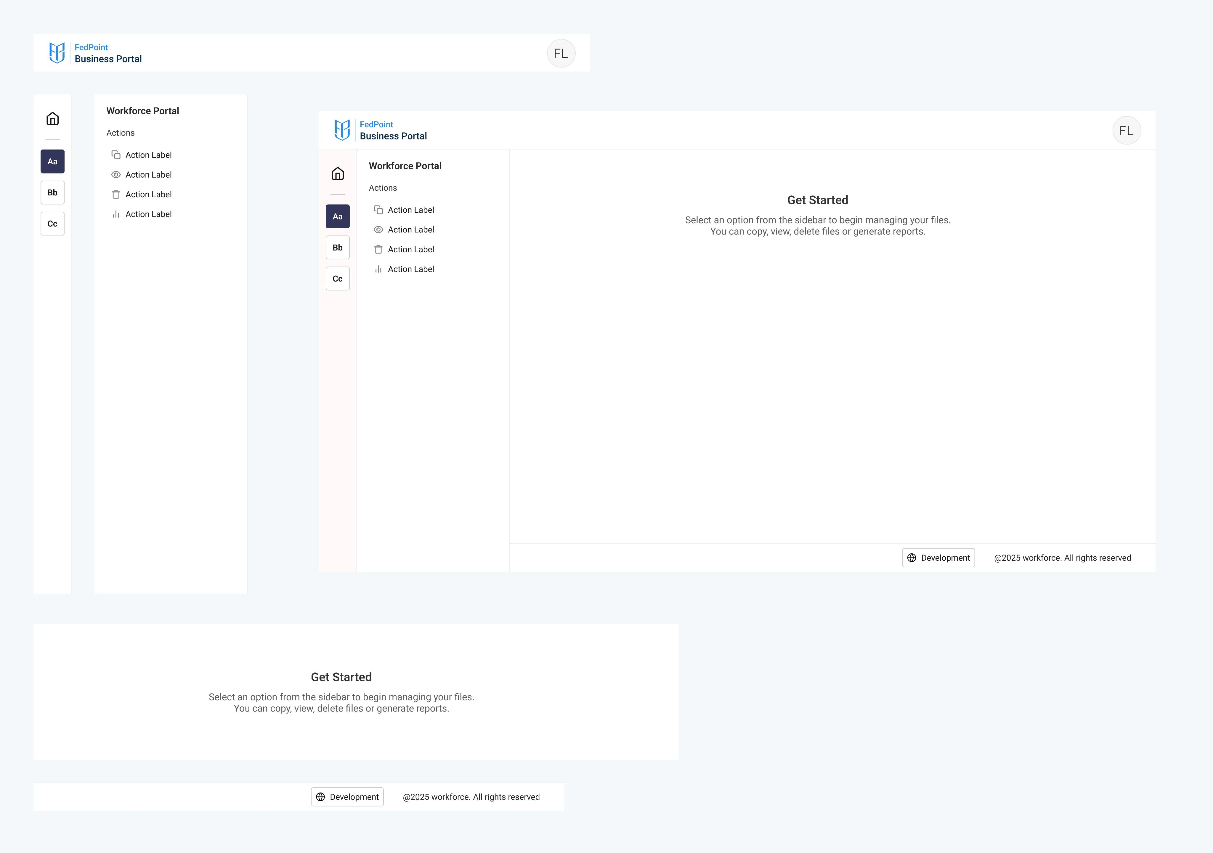
Design System components arranged for the Business Portal
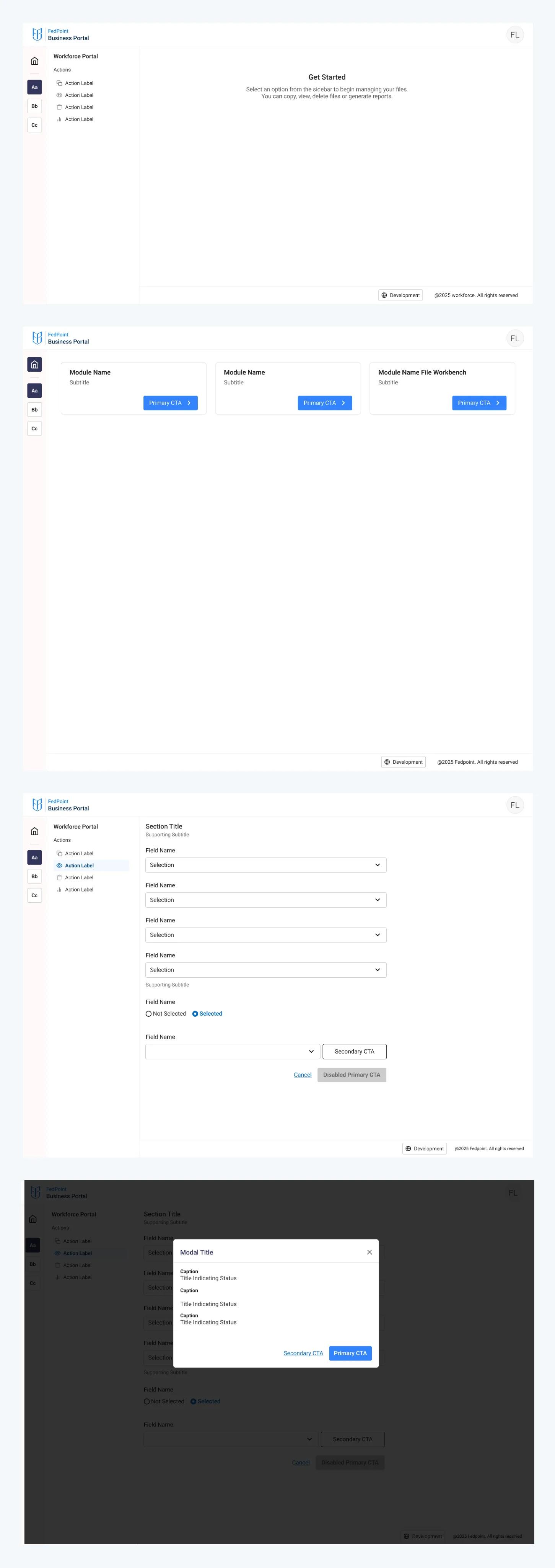
Pages arranged using the same components in minutes.
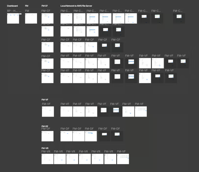
B2B Business Portal
Impact
B2B Portal Modules arranged in a couple of days that would otherwise take weeks.
Before this system, every new product at FedPoint started from scratch. Engineers rebuilt the same components. Designers re-made the same patterns. The system I built changed that one foundation, multiple products, zero duplication.
~40%
faster design on new
products no more
rebuilding components
from zero.
~30%
less engineering time
states, variants, and
specs pre-handled in
react.
1 source
of truth for all products
update the token,
everything updates
From Andrew
Zarbo (UX Lead)
B2B Portal Modules arranged in a couple of days that would otherwise take weeks.
"Harshveen was without a doubt one of the best, most talented and thoughtful designers I've ever had
the pleasure of working with. His ability to learn and fully understand what the problem is, and then
use his extensive background and research skills to craft just the right solution was apparent within just
a few weeks on the job.
"The biggest thing he helped us achieve was developing an extensive enterprise design system that we
can now leverage to build all sorts of tools and applications. The amount of incredible work he
produced in just 5 months was nothing short of astounding and was exactly what we needed to push
our UX group, and our company as a whole, into a more modern direction.
Most of all, as someone who has been practicing UX for the better part of 10 years and was technically his senior, he taught me so much that I was not expecting and had never considered, and that in turn has made me such a better designer - and for that I am truly grateful!”
fin.
Thank you for reading. Connect for the live demo.
© 2026 harshveenkalsi.com