Harshveen’s Product Playbook

How I helped account admins at LeadSquared build complex forms faster.

UX Design at LeadSquared
UX Research
Product Design
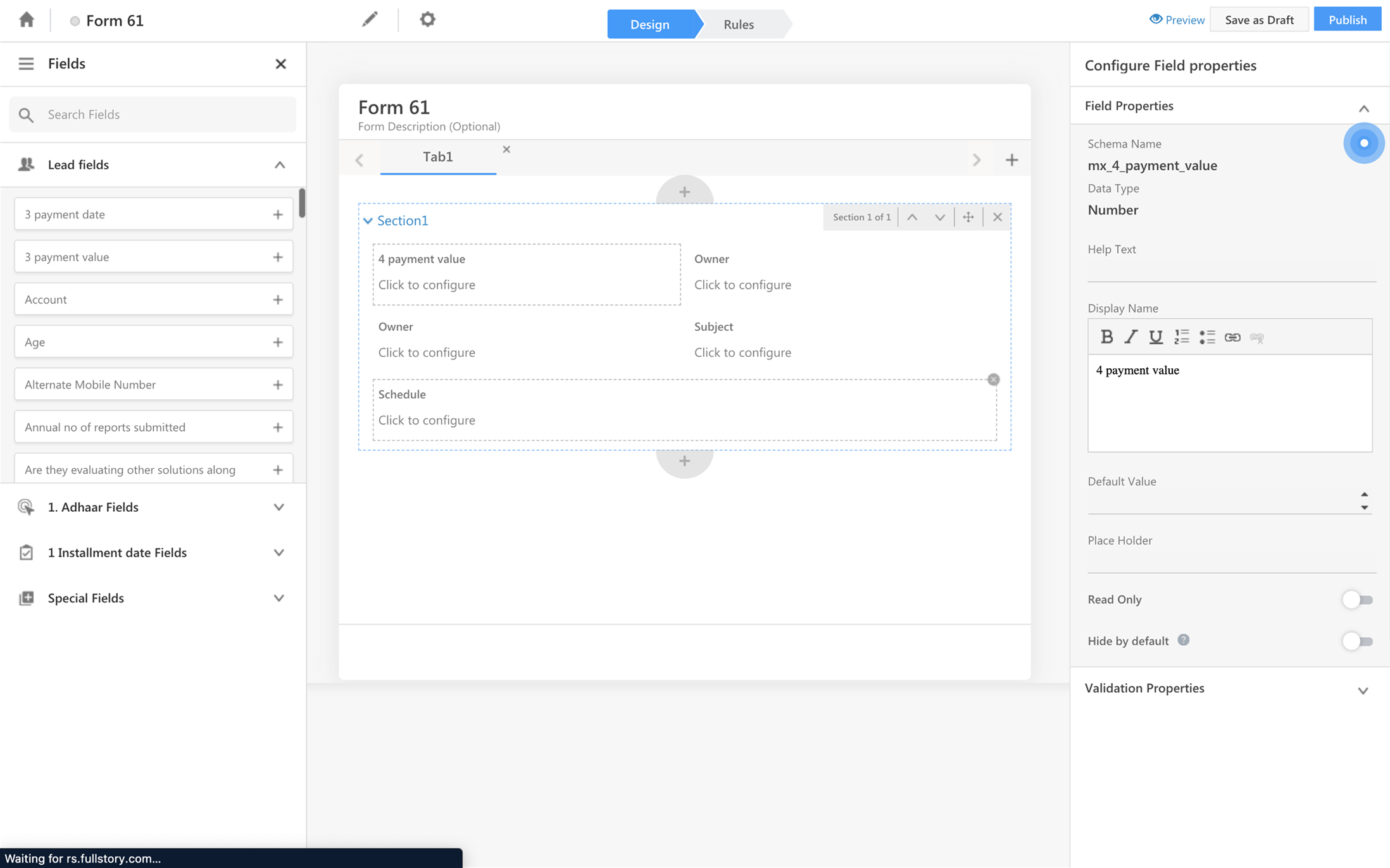
In 2 months, I deliver the UX for a modular, systems-driven form builder tool from 0→1, increasing account administrator’s productivity by 44%.
LeadSquared's existing form builder was buried under “global settings” on the CRM and worked fine if account administrators were creating one form once a while, for one entity, for one department. But when the sales CRM started acquiring clients from different industries and developed more uses cases, the admins needed to create multiple complex forms and deploy it at different level of the sales pipeline.
Admins were managing finance applications, educational records, and real estate pipelines simultaneously. Building separate forms for leads, opportunities, activities, tasks was a tedious and redundant workflow with business scalability issues that could be fixed only if the form builder was designed efficiently before developing.
Harshveen Kalsi (UX)
Sneha Chowdhary (Product Manager)
Clement (Full-stack Engineer)
“It’s a pain to create forms on the CRM. It only handles single-entity forms, has no multi-step support, no field-level configuration, and forces us through unnecessary navigation panes just to do basic work which is costing a lot of time, patience, and is slowing down our overall team productivity.
- Account Administrator
We ran structured interviews with active LeadSquared administrators serving finance, education, and real estate business cases to understand their workflow and how they completed the entire process with the existing tool.
When a user triggers a lead-related action, such as adding a new lead or receiving a call, LeadSquared presents the appropriate form based on the context. Each form pulls from the same pool of lead fields defined in your account, but displays only the fields you have configured to show for that form type.Administrators configure each form independently through Settings > Leads > Lead Forms. Fields can be shown, hidden, or reordered by dragging them between sections. Fields moved to the Hidden Fields panel are not deleted; they are simply excluded from display in that form. This means the same field can appear in one form type and be hidden in another.
Existing workflow for the forms creator discovered during research
Heat-maps and data patterns on Fullstory dashboard resonated interview participant’s navigational concerns.
Session after session, admins clicking through navigation panels that occupied 45% of the screen that did almost nothing. Stalling at configuration steps up, down, left and right. Abandoning mid-task again and again. Same user, restarting the form creation again and again. The heat-maps confirmed what the interviews suggested, the tool was being used to create just one form of one type at a time. Too much redundant work needed for a complex forma involving lead, activity and tasks.
With all the insights and user challenges we uncovered, to segregate what was important and needed priority attention, instead of the regular affinity mapping exercise, I created a pain-point prioritization matrix instead, where Cross-entity linking + field config failures is the single biggest problem voiced by almost all the interview participants, followed by 45% screen space waste, and then form preview issues and eventually the design of the form in general.
I also analyzed how our competition dealt with form creation. Evaluating similar workflows at JotForm, Cognito Forms, Typeform and Salesforce.Back in 2018, Typeform was the hype because it introduced a new way of creating forms, a new structure of dealing with multiple form fields and types, a new way of enabling customization and settings making the users feel like they have control over everything.This helped me understand and create a mental model of the general administrator persona and what tool structure actually worked.
I started brainstorming by flipping the current mental model.
During an interview session, I watched an admin click through the same navigation panel 6+ times complete a simple task. The general settings panel on the side occupied 45% of the screen and did almost nothing. This was a systems problem that caused a lot of confusion to the admins while creating multiple complex forms.
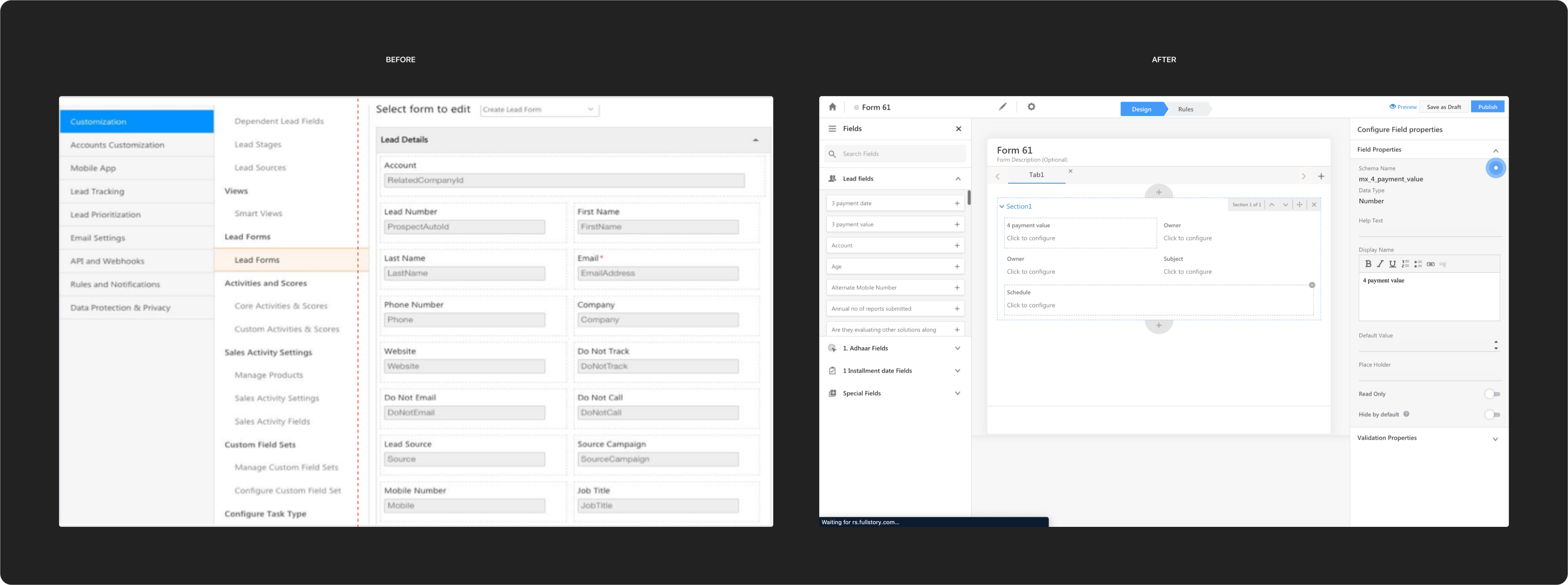
Existing Form Builder
Settings Page
The existing builder had it backwards. Navigation owned the screen and the form was an afterthought. Look at the original interface. A full sidebar of navigation on the left Customization, Lead Tracking, Email Settings, Rules and Notifications, none of it relevant to the form you're trying to build. A secondary navigation nested inside that and only after navigating through all of it, a flat form sitting in the remaining space with no configuration, no preview, no context.
You cannot click on the field, you cannot customize any field it almost feels dead. Felt like every field needs to be setup somewhere else but not sure where. So I started thinking how could the form be more interactive instead and have some life in it.
HMW design a tool that felt more human, designed by a human, engineered by humans for humans.
What if the form lived at center with fields and settings built around it contextually
My idea was to stop treating the form builder like a settings page and convert it into a canvas of it’s own. Give the form the entire screen real estate and make the live preview not an added functionality but a resting view by default. Put the live preview at the center, exactly as it would render for the end user. Not a separate preview mode you navigate to after saving.
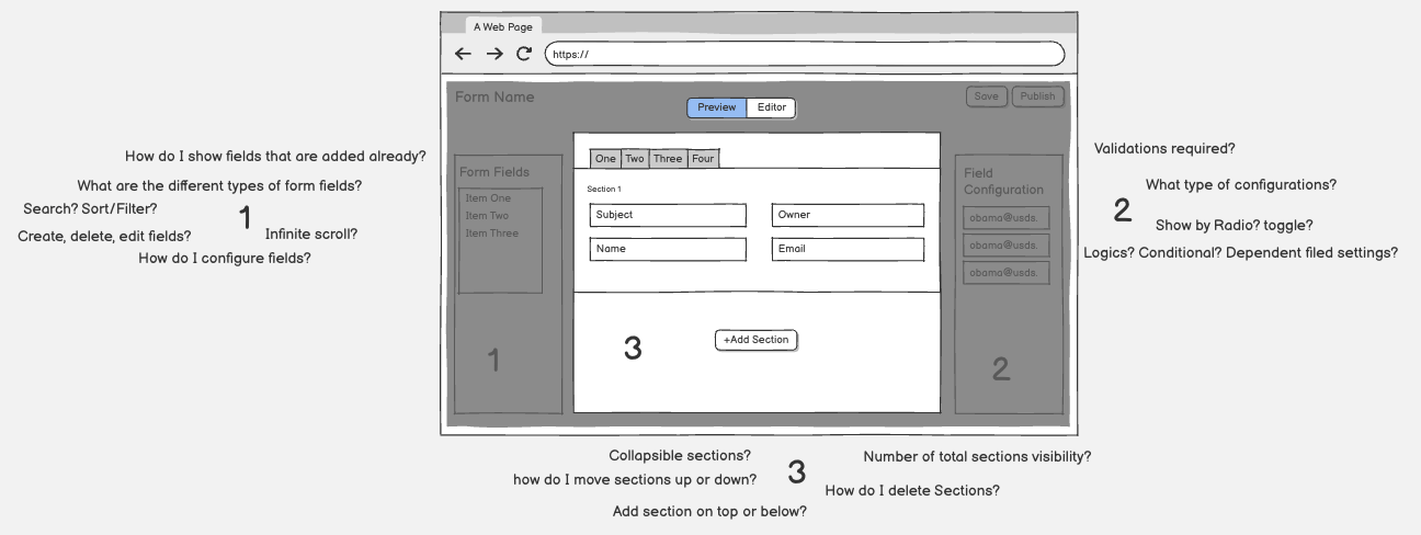
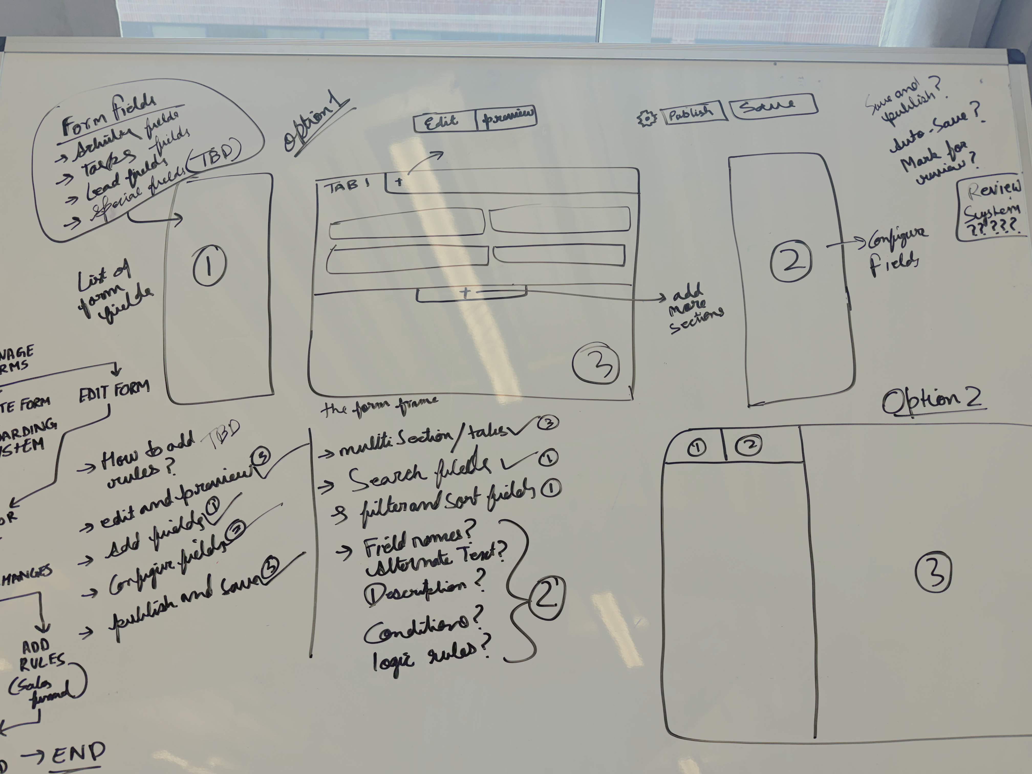
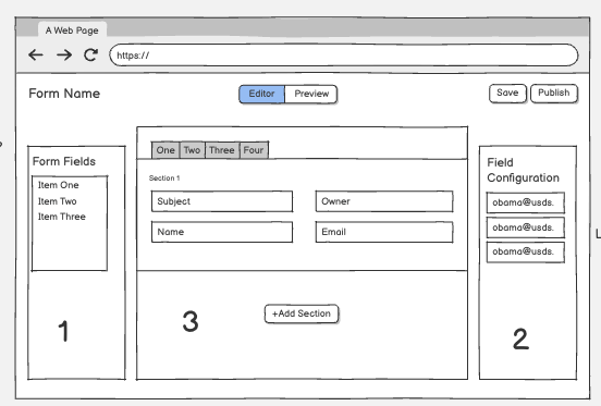
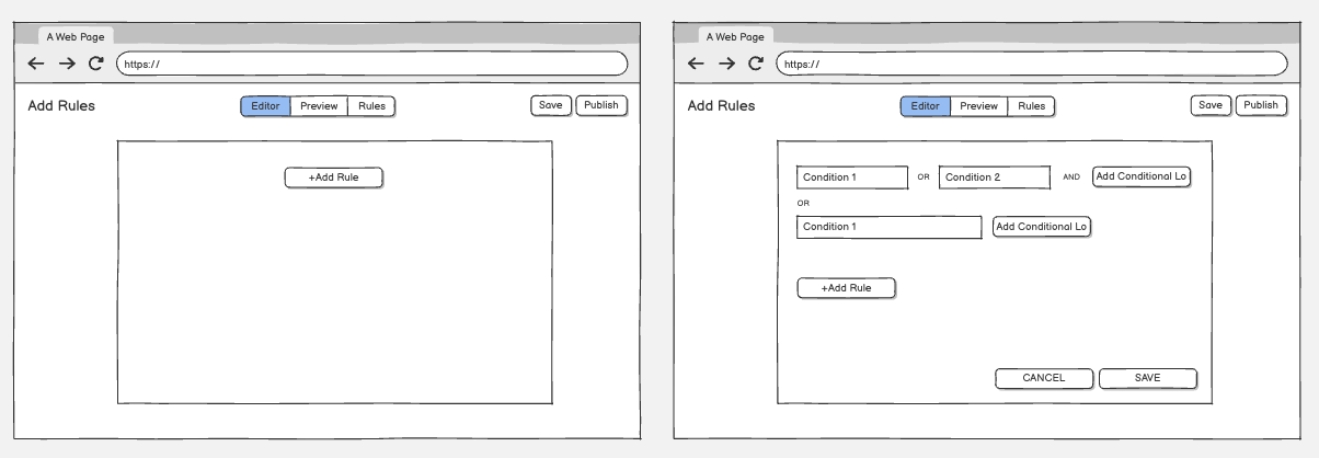
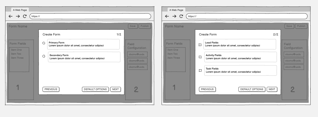
White-boarding and Wire-framing
Then build everything else around it depending on what was priority. The field picker on the left and the configuration panel on the right, appearing only when a field is selected. The step navigator at the top when the form has multiple steps. Nothing on screen that isn't directly serving what the admin is doing at that exact moment.
The navigation that used to own 45% of the screen is now gone. The publish-and-check cycle that forced admins to leave the builder just to see what they'd built was also removed. The admin never loses sight of what they're building. That's the Heuristics principle #1 : Visibility of System Status. And once that was the established, every other decision followed naturally from it.
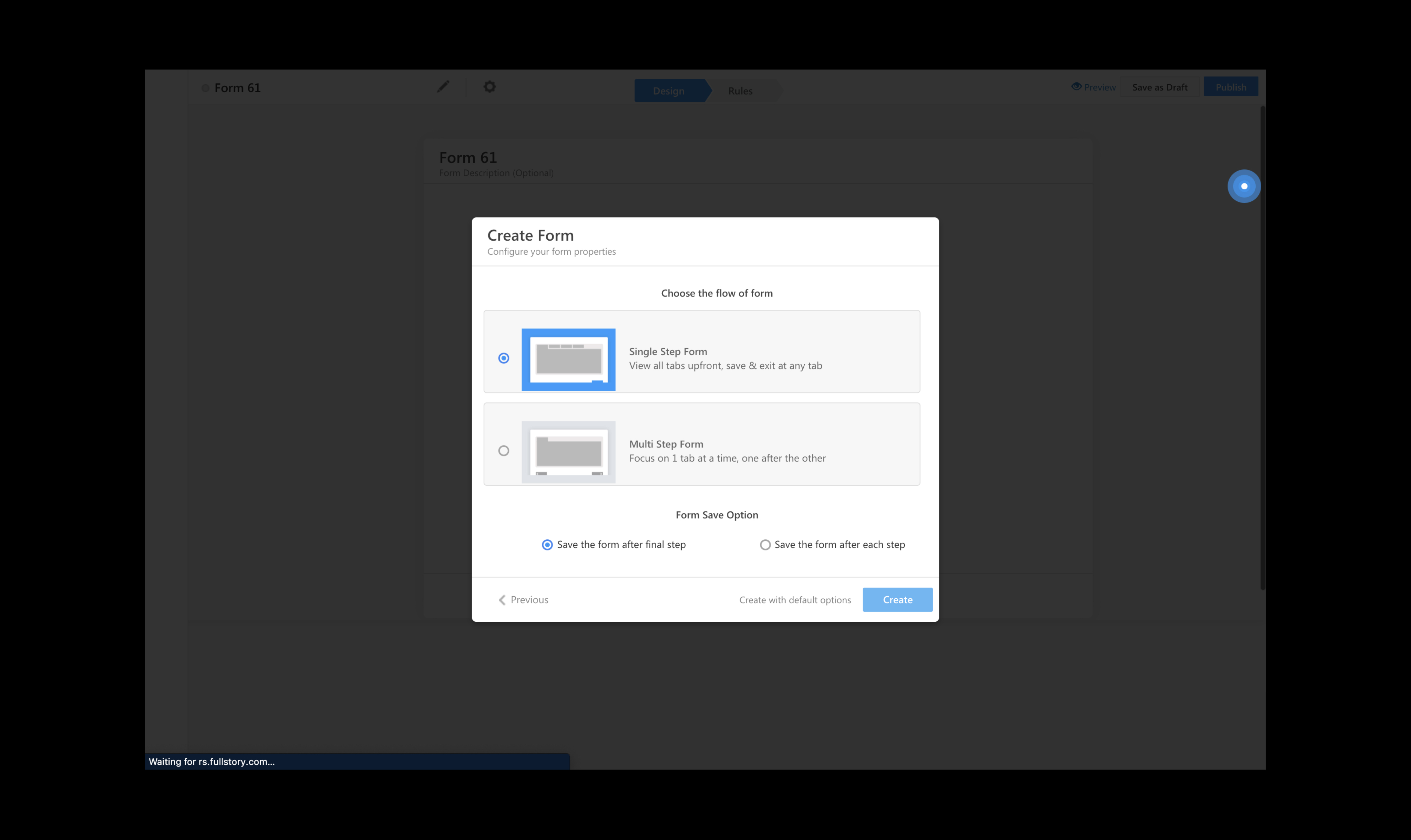
My solution started with an onboarding system, that lets the tool know what it's working with before the admin starts creating anything.
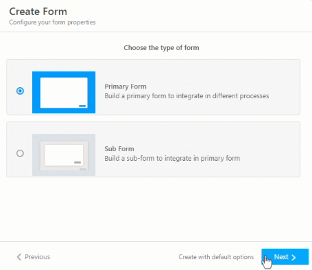
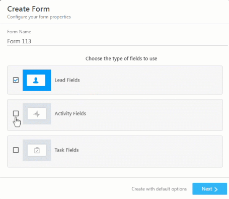
- Type of Form
- Fields to configure in the form
The onboarding system not only reduces cognitive load for admins by surfacing only the relevant form type but also trims down the backend load by suppressing unused features and their associated calls.
- Flow of the form
Guided onboarding system, Select the form type before entering the build mode.
Form that feels like a form, exactly how it appears to users when published, so the creator does not have to make an extra effort to publish and then test it. Creators test it live while creating.
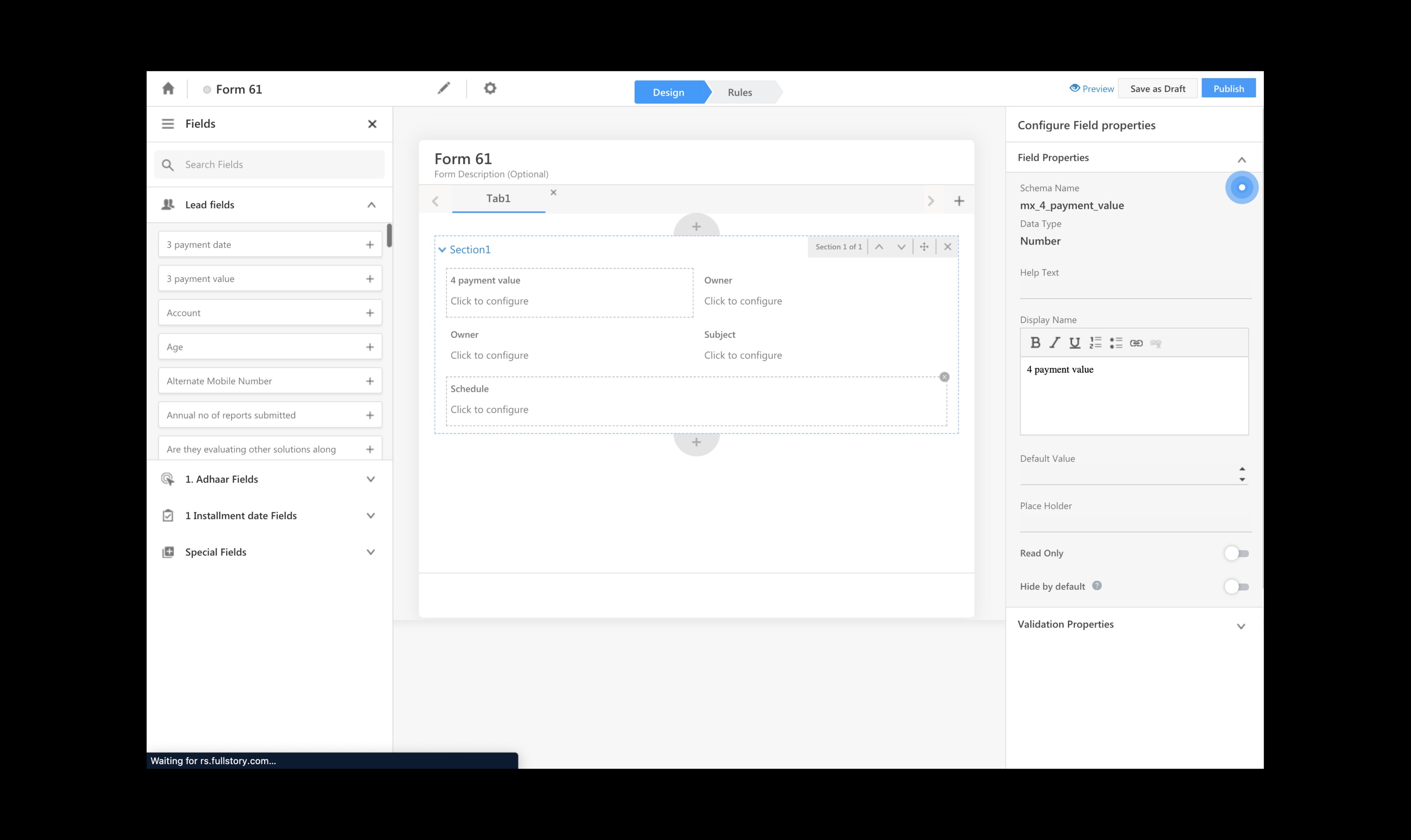
The final form that lives at the center
The left panel is the field library. Searchable and grouped by multiple entity types, addable with one click or drag an drop on the from. Lead fields, activity fields, task fields, and special fields all of it organized and within reach on the left.
Once the field is added, configure it on the left. All related properties to a specific filed mapped in the backend. So when you select a field and place it on the form, you see the configurable properties on the right. Display name, data type, help text, default value, placeholder, read only, hide by default, validation rules all on the same page on the right, when you need it the most. Select fields on left and then, configure them on right.
The field panel on the left and configuration panel on the right.
Setting rules for the form i.e positioning it on the sales funnel
Every decision I made were solutions to challenges our users kept telling us i.e they never wanted to lose sight of what they were building and everything configuration should be done instantly. Not at step one, or at step five. They build multiple forms throughout the day, not one. So it should be efficient and scalable.
The form is always visible, always accurate, always the center of gravity, and verything else followed from it.
With the new forms creator in place, admins reported completing the same complex workflows nearly 16 minutes faster.
Previously, the admins themselves confirmed the ballpark ETC when we asked the time it took to complete a complex form creation workflow, “...around 30–40 minutes for a standard complex form, might be more if a new employee is making one...”
With the new design, admins started directly on the canvas. No settings page to configure fields in first. No separate navigation to find the form creator. No opening a second browser window just to see what the form looked like. Everything lived in one place. Select your entities, drag your fields, configure in context, see it live as you build. Start to finish.
After implementing the new tool and 4 weeks of usability testing, admins reverted back saying completing the same complex workflows took approximately 15-20 minutes.
36 minutes to 20 minutes.
(36 - 20) ÷ 36 × 100 = 44.4% — rounded to 44%.
36 min
Before
20 min
After
44%
Delta Improvement
Impact
80%+
Screen used for form creation process vs less than 55% before.
Live
Real-time form preview via toggle switch, no context switch required.
What the account administrators liked the most
It shipped successfully, and then it kept growing
The redesign went live and account administrators noticed the improvement immediately. The feedback we received wasn't just positive, it was the kind that told us that the work actually landed. Admins who had spent years working around the old builder were now completing complex, multi-entity workflows faster than anyone had projected, 44% faster.
Harshveen’s Product Playbook