Harshveen’s Product Playbook

Researching behavioral patterns of elderly federal employees to fix accessibility challenges on BENEFEDS.gov

UX Design at FedPoint
Data-driven Design
UX Research
Product Design

To comply with strict non-disclosure agreements, all proprietary data, live interfaces, and specific workflows have been omitted. As the primary contributor and owner of this project at FedPoint, I outline what I did, how I did it and the exact steps I followed to successfully solve the challenges in a set time frame. To know more about the research data, design wireframes and the resulting business impact, please connect.
BENEFEDS.gov is the official secure online portal used by federal employees, retirees, and uniformed services members to enroll in and manage FEDVIP dental and vision plans, as well as pay premiums for Federal Long Term Care Insurance (FLTCIP).
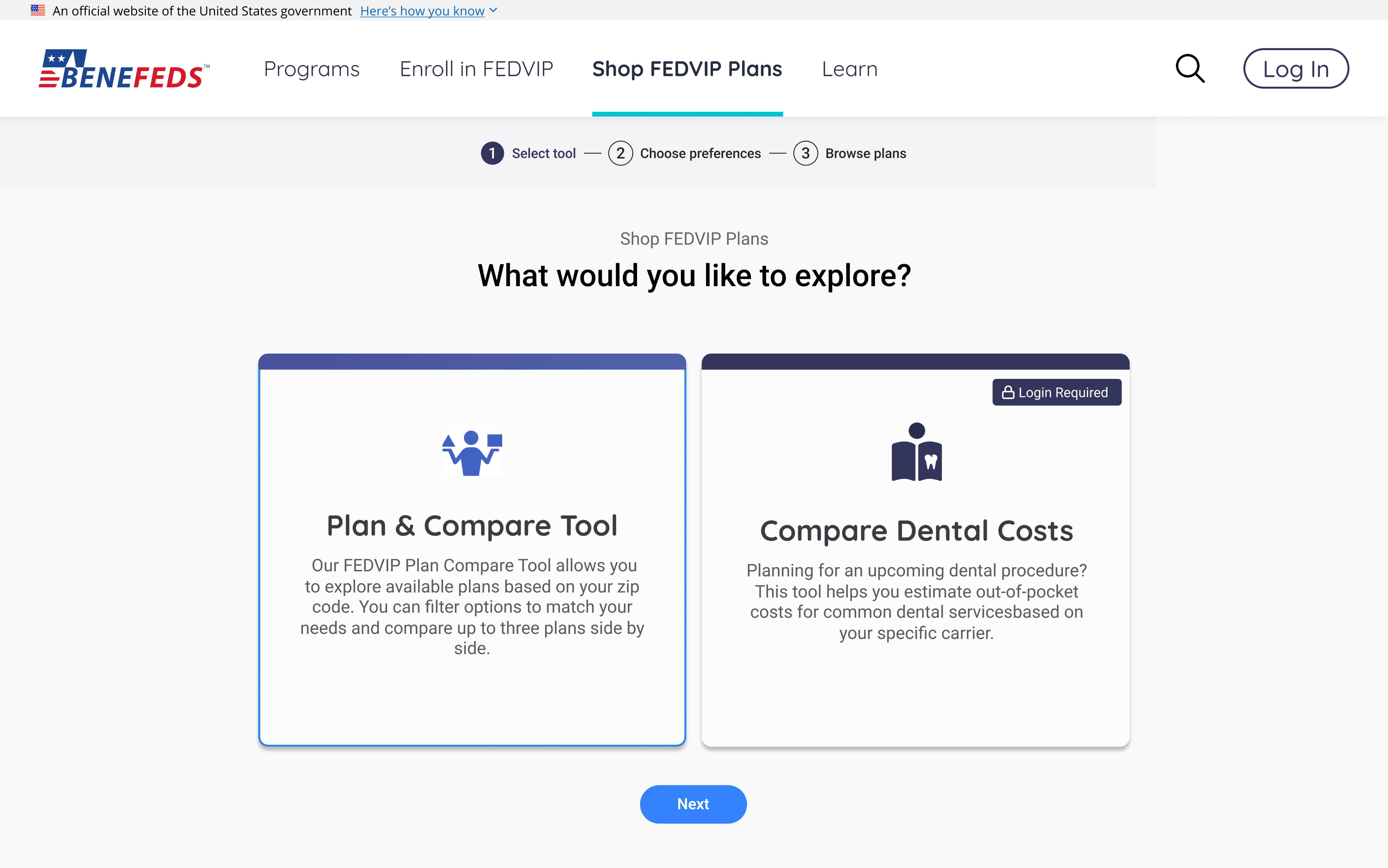
The plan enrollment tool on BENEFEDS.gov contained critical accessibility violations and UX errors, that prevented a significant portion of federal employees, many of them elderly or assistive-technology-dependent from completing benefits enrollment independently.As the UX Lead for this project, I led the 0-1 investigation to identify the violations/UX errors, and provided accessibility fixes for them. Started with performing research, heuristic evaluations, interviewed users, identified the accessibility violations and eventually, re-designed the tool with better accessibility and information clarity.
Ella Manzelli (UX Research)
Andrew Zarbo (UX Design)
James Roth (Team Lead)
Ali Shah (Engineering)
Harshveen (UX Lead)
ISO 9241-210 compliant HCD, widely used in enterprise & government SDLC
A simple yet powerful framework which gave me me clear direction based on what I already knew, what needed to be uncovered, and what came next. Over the years, my work process has evolved to be a mix of agile and double diamond but today it adapts to the context and whatever best fits the problem at hand. For this one, Human-centered Design made more sense.
Understanding the target persona: Internal survey data from 2021 revealed that the average age of BENEFEDS user is mid-40s - elderly civilians.
So my first step was to understand how users in this age group think, feel, and act on the web, and simultaneously add those relevant attributes to the persona. Eventually I understand and solve challenges for this persona, I solve challenges for the primary users of BENEFEDS.gov.On the side, I juggled articles on NNGroup.com which spoke about UX for older adults. Two articles that helped me out the most were,NNGroup.com/Usability for Older AdultsNNGroup.com/Middle-Aged Users’ Declining Web Performance
Key attribute based on research articles: Cognitive Load Capacity
Humans's ability to use websites and understand complex systems declines by 0.8% per year.
Cognitive Load Capacity
Age


Decline in cognitive resources
Research indicates that usability performance decreases by approximately 0.8% per year between ages 25 and 60, reflecting slower information processing and reduced working memory among older adults.
Require clearer navigation patterns and interfaces
Middle‑aged users spend 0.5% more time per page and visit 0.3% more pages per task, highlighting the need for streamlined, intuitive navigation that reduces cognitive effort and supports efficient information discovery.
Accessible Design Gains
Optimizing usability & accessibility can improve task success rates by up to 25% and reduce error rates by 30%, creating a digital environment that’s not only reliable and intuitive but also instills confidence, comfort, and trust.
Empathizing with the persona, via Qualitative Interviews.
To understand where the tool was actually going off track when users were using it extensively, I conducted moderated interview sessions with 6 users using structured questions and task-based activities on the BENEFEDS.gov portal to uncover friction points and observe where users got stuck. Synthesizing Ella’s proxy interview data with my moderated interview findings, I identified recurring pain points and surfaced the issues users flagged most consistently. I prioritized resonance over echo.
Digging up the platform analytics to get Quantitative Numbers.
I spent time analyzing the data on Looker Studio dashboard with platform analytics gathered from GA5 to check the “time” a user spent on the specific section, that interview users mentioned they have issue with. A 4-step onboarding with simple questions shouldn't take more than 5 minutes. But when the data showed an average of 6–7 minutes on that section, it confirms that the users were spending too much time in that section. Too much cognitive resources being spent in the wrong place. Time & resources saved there, could be used in deciding the right plan in the plan section part of the user journey.Another exciting insight,
While observing page views on GA4 and analyzing the pattern, we found that the users were resuming to the first page of the onboarding page again and again.Extremely high # of engagedSessions on that page and average session time being very less. It again matched with the interviews where 8/10 participants expressed “Back Navigation” to be an issue. Click back and it takes you out of the entire flow. No matter how many steps you completed to get there, no matter how many filters applied to reach the right plan, one accidental back click and you need to repeat all the clicks again. A real pain point for not just for the younger audience but for the older adults for sure.
Challenged uncovered
These weren't separate problems. They were the same problem, a system that violated Nielsen's heuristics 1, 2, 3, 5, and 8 simultaneously, across the exact touch-points that mattered most.
Visibility of system status and jargon overload
What we initially started working on,
"PPO." "FEDVIP." "FEHB." Acronyms with no explanation, no context, no plain language alternative. Users averaging mid-40s were encountering terminology they'd never seen before and being asked to make decisions based on it. There were no progress indicators. No sense of how far they'd come or how much was left. Just a sequence of unfamiliar questions with no visible end.
Broken back navigation resulting in flow restarts.
What we initially started working on,
Accidental back-navigation triggered full restarts. There was no recovery path. A user who clicked the wrong thing didn't go back one step, they went back to the beginning. For someone with limited time and limited technical confidence, that's not a minor inconvenience. It's a reason to give up entirely.
Cognitive load was front-loaded, not progressive.
What we initially started working on,
The plan cards were packed with information presented at equal visual weight, making it impossible to quickly identify what mattered. Users didn't realize clicking a link would reveal plan details. The cognitive load was front-loaded, not progressive.
Filters were hidden. Sort was nearly invisible.
What we initially started working on,
The tools that should have helped users narrow down their options were buried. Filters were sticky and lacked critical options, no way to filter by carrier or annual premium. The sort feature was so poorly placed that users scrolled past it entirely. The interface had the functionality, but the users just couldn't find it.
HMW improve the benefits enrollment experience so that middle-aged federal civilians can navigate, compare, and select a benefit plan without cognitive overload, navigational dead-ends, or missing system feedback and complete enrollment with confidence?
First, I simplified the onboarding flows.
I started with flowcharts to map every step a user took before they even reached the plan selection tool. Then I started reverse engineering. Combined steps. Replaced acronyms with plain language, and introduced tool tips at the right places. Added progress indicator component in the design system first, in this project second and then, every other part of the portal wherever required. So our users always knew where they were and what came next. The goal was to surface system status to the user at all times, and minimize interaction cost before the user even gets to the decision they came to make.
Second, fixed navigation so mistakes weren't permanent.
Fixing back navigation was a debate between UX and engineering, where we couldn’t help but stick to the existing navigation due to standard protocols for .gov websites. A quick fix? Let me introduce an alert modal every time a user wants to, or accidentally moves away from the page. I identified the links, blind spots and spaces where that occurred and introduced a modal with the right UX copy for every instance. My goal here was to absorb accidental user errors, and guide them back to safety, not amplify them.
Third, restructured plan cards for scanning, not reading.
A live brainstorming session with Zarbo and Lucy (UX Designers) intended for 30 mins that crossed hours. What’s the top 3 priority information a user wants to see when they see scan a plan card? What should pull their eye first, second and third? So many design options. So many different card designs, Different typographical hierarchy. Layouts. But the one that showed the right information, the right way, was selected. Visual clutter eliminated. The most important signals price, coverage, and carrier, all readable at a glance. Click the card to see all the details, available on demand, not front-loaded onto a card that was already asking too much.
Fourth, surfaced filters and sort where users actually look.
Filters came out of hiding. Sort placed where the eye naturally goes. New filter options added by carrier, by annual premium. Page layout readjusted on a golden ratio base. My goal here was to help users make a confident decision without the interface or a layer of UI getting in the way. Every configuration, every option, every next step available exactly when they needed it. Not something they had to hunt for after frustration had already set in.
5+ WCAG 2.2 violations resolved. Navigation broken for 8/10 interview users, fixed. Onboarding jargon replaced with plain language. Plan card information hierarchy redesigned for scalability. Filters and sort surfaced and functional. Enrollment flow restructured to eliminate the drop-off points identified in testing. Tool layout improved for eye movement and natural web usage patterns.
Filters came out of hiding. Sort placed where the eye naturally goes. New filter options added by carrier, by annual premium. Page layout readjusted on a golden ratio base. My goal here was to help users make a confident decision without the interface or a layer of UI getting in the way. Every configuration, every option, every next step available exactly when they needed it. Not something they had to hunt for after frustration had already set in.
Solutions Delivered
5+ WCAG 2.2 violations resolved.
Navigation broken for 8/10 interview users, fixed.
Onboarding jargon replaced with plain language.
Plan card information hierarchy redesigned for scalability.
Filters and sort surfaced and functional.
Enrollment flow restructured to eliminate the drop-off points identified in testing.
Tool layout improved for eye movement and natural web usage patterns.

The full feature roadmap sitting on IME matrix
While the tool itself is was big change requiring a good set of resources for development. I strategized a feature lifecycle plan based on discussions with engineering, business and other team members to best utilize the amount of resources available every sprint, and push the most important part of the project first.To me, understanding how a solution gets implemented within existing development resources, limitations, and bandwidth is just as critical as translating the written requirements into a functional prototype. The Impact Effort Matrix helps evaluate, break down, and prioritize solutions into smaller sprint-digestible projects, and assign them to Big Bets, Quick Wins, Fill-Ins, and Time Wasters.This helped me create a dev-go-to-plan which I pitched to the stakeholders to eliminate the overwhelming feeling, while successfully getting a buy in.

Harshveen’s Product Playbook